
Table of Contents
- Introduction: The Battle for Member Attention
- Defining the Serial Position Effect in a Digital Context
- The Primacy Effect: Hooking Members Instantly
- The Recency Effect: Driving High-Impact Action
- Solving Information Fatigue: Chunking and the Saliency Bias
- Architecting Visual Hierarchy for Quick Decision-Making
- AI-Driven Dynamism: Personalizing the Serial Position
- Conclusion: From Attention to Retention
- References
Introduction: The Battle for Member Attention
In the high-velocity world of 2026 fintech, attention is the’s most valuable currency. For credit unions, the challenge isn’t just providing services; it’s ensuring members can navigate them without cognitive friction. As digital branches evolve into complex ecosystems of lending, investing, and AI-driven advisory, the risk of “information overload” has never been higher. This is where Deep UX Theory—specifically the Serial Position Effect—becomes a non-negotiable architectural requirement.
As elite SEO Content Strategists at Credit Union Web Solutions, we see daily how traditional “list-heavy” designs are failing. Members aren’t reading; they’re scanning. If your credit union’s website or mobile app doesn’t account for how the human brain prioritizes information based on its sequence, you are effectively burying your high-margin products in a digital graveyard.
Defining the Serial Position Effect in a Digital Context
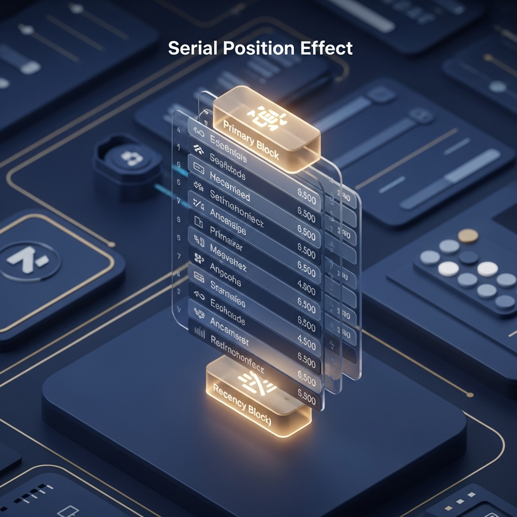
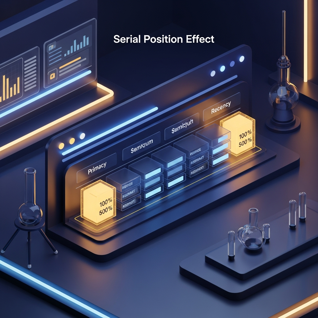
The Serial Position Effect, a term coined by psychologist Hermann Ebbinghaus, describes the tendency of a person to recall the first and last items in a series best, and the middle items worst. In 2026, this psychological framework has moved beyond memory labs and into the heart of Fintech UX Design.
The effect is composed of two primary components:
- The Primacy Effect: Items at the beginning of a list are stored in long-term memory more easily because the brain has more time to process them.
- The Recency Effect: Items at the end of a list are stored in short-term memory (working memory) because they are the most recent inputs.
For a credit union, this means the “middle” of your navigation menu, your product list, or your dashboard is essentially a blind spot. To ignore this is to invite member frustration and abandoned applications.
The Primacy Effect: Hooking Members Instantly
The Primacy Effect is why your primary navigation and the “top-of-fold” content are critical. In 2026, we don’t just put “Accounts” first because it’s traditional; we do it because it establishes the foundational context for the member’s session. According to research by Onething Design, transparent fintech UX ensures users always know where they are, and the first piece of information they encounter sets the emotional tone for the entire interaction.
Strategic Implementation for CUs:
Place your most critical “Value Drivers” first. If your strategic goal is loan growth, your “Apply for Loan” or “Interactive Rate Calculator” should be the first item in your primary mobile tray. By utilizing the Primacy Effect, you ensure that even if the member gets distracted, the core value proposition of your credit union remains “top of mind.”
The Recency Effect: Driving High-Impact Action
If the Primacy Effect is about memory, the Recency Effect is about action. The last item a member sees is the one they are most likely to interact with immediately before leaving the page. This is why the “Checkout” button is always at the bottom of a cart, or why “Logout/Settings” are often at the far right or bottom of a menu.
In the context of a 2026 digital branch, the Recency Effect should be used for “High-Impact Transition Points.” For example, at the end of a transaction list, the UI shouldn’t just stop. It should offer an AI-generated suggestion: “You spent $120 on dining this week. Want to move $20 to your ‘Summer Vacation’ savings goal?”
This “End-Node Optimization” ensures that the member leaves the app feeling productive, leveraging what Pixflow describes as emotional design cues that impact financial decisions. A positive final interaction significantly boosts the “Peak-End Rule” perception of your entire credit union brand.
Solving Information Fatigue: Chunking and the Saliency Bias
One of the most expensive misconceptions in fintech is that more information equals more value. In reality, simplicity isn’t about removing information—it’s about removing uncertainty. To combat the “sagging middle” of the Serial Position Effect, designers use “Chunking.”
By breaking long lists into groups of 3 or 4, you create multiple “Starts” and “Ends,” effectively multiplying the number of items that benefit from primacy and recency. Instead of a list of 12 loan types, modern CU design chunks them into “Vehicle,” “Home,” and “Personal” categories. Each category then has its own Serial Position dynamics, making the information far more digestible.
Architecting Visual Hierarchy for Quick Decision-Making
Visual hierarchy is the “Silent Language of Design.” It directs the member’s eye through the serial positions you’ve prepared for them. In 2026, we utilize Glassmorphism and Spatial Lighting to create depth. Items with higher visual “weight” (brighter colors, larger shadows, or subtle animations) can actually override the Serial Position Effect, creating a “Von Restorff Effect” (the isolation effect) where a distinct item is remembered better than others, regardless of its position.
Applying the Mirror Technique in UI:
Just as Jeremy Miner suggests “Mirror Selling” to project energy, your UI should “Mirror” the member’s intent. If a member is deep in a mortgage application, the visual hierarchy should shift to prioritize progress and “what’s next,” suppressing secondary distractions. This creates a focused environment that respects the member’s time and cognitive load.
AI-Driven Dynamism: Personalizing the Serial Position
The most radical shift in 2026 is Generative UI. We no longer design static lists. With AI integration, the “Serial Position” of elements on a dashboard changes based on predictive logic. As noted by G & Co. Agency, fintech UX must support adaptive layouts that tailor workflows to the individual.
If the AI detects a member is consistently checking their credit score on the 1st of the month, that widget moves to the “Primacy” position (the top left) on that day. On the 15th, when bills are due, “Pay Bills” takes the “Recency” position (the bottom right call-to-action). This isn’t just “design”—it’s an intelligent, empathetic digital branch that anticipates member needs before they even articulate them.
Conclusion: From Attention to Retention
Mastering the Serial Position Effect is not just about making a website look “modern.” It’s about understanding the biological constraints of human memory and attention. When you architect your credit union’s digital branch with deep UX principles, you transition from being a utility to becoming a partner.
At Credit Union Web Solutions, we believe that every pixel should serve a purpose. By leveraging the Primacy and Recency effects, chunking information to avoid fatigue, and using AI to personalize the journey, you ensure that your members don’t just “use” your services—they remember them, trust them, and stay loyal to your credit union in an increasingly crowded fintech landscape.
References
- Fintech UX Design Guide 2026: Creating Financial Experiences – Fuselab Creative
- Top 10 Fintech UX Design Practices 2026 – Onething Design
- Fintech UX Best Practices 2026: Build Trust & Simplicity – Eleken
- Emotional Design in FinTech: How UI Cues Impact Financial Decisions – Pixflow
- The Best UX Design Practices for Finance Apps in 2026 – G & Co.
- A Guide to UX Design for Fintech in 2026 – Wonderment Apps
This article was brought to you by GrafWeb CUSO – Building the future of digital credit unions.
Related Posts

The Zeigarnik Effect and Peak-End Rule in 2026 Credit Union UI Design: Architecting Memorable Digital Member Journeys
Credit Union Website Design: Fintech API Integrations for Seamless Third-Party Services and Member Engagement in 2026