📑 Table of Contents
- Introduction: The Cognitive Architecture of Finance
- Understanding the Law of Common Region in Fintech
- The Psychology of Grouping: Why Members Crave Structure
- Strategic Implementation: From Dashboard to Checkout
- Balancing Visual Load: Avoiding the "Clutter Trap"
- ADA Compliance and Cognitive Accessibility
- Sales and Marketing Alignment: Creating the "Opportunity Zone"
- Conclusion: Building the Future, One Region at a Time
- References
Introduction: The Cognitive Architecture of Finance
In the high-velocity world of 2026 digital banking, the battle for member attention is no longer won by features alone. It is won by the efficiency of information processing. For Credit Unions, the "Digital Branch" is no longer a metaphor; it is a primary infrastructural reality where billions in assets are managed through pixels and gestures. As we navigate this landscape, the principles of Gestalt psychology—specifically the Law of Common Region—emerge as the silent architects of trust and usability.
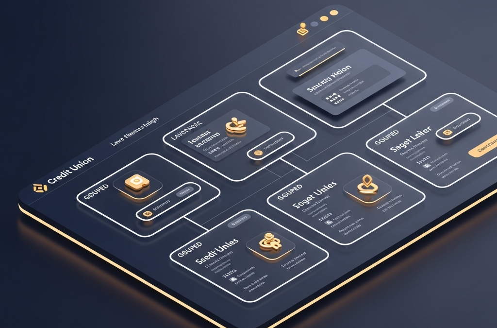
The Law of Common Region states that elements tend to be perceived as a group if they are sharing an area with a clearly defined boundary. In a complex financial interface where a member might be balancing credit card rewards, mortgage applications, and high-yield savings data simultaneously, clear boundaries aren't just an aesthetic choice; they are a cognitive necessity. When information is grouped logically within a defined region, the member's brain can "chunk" that data, reducing cognitive load and increasing the speed of decision-making.
Understanding the Law of Common Region in Fintech
Originally identified by Stephen Palmer in the 1990s as an addition to the classic Gestalt principles, the Law of Common Region is perhaps the most powerful tool for creating visual hierarchy in a dense UI. In the context of a Credit Union website, think of your "Quick Actions" bar or your "Account Overview" cards. These are not merely boxes; they are mental containers that signal to the user: "Everything inside this border is related."
By utilizing background colors, subtle borders, or shadow elevations, designers create "regions" that separate transactional data from promotional content. This separation is critical for building a "Digital Branch" that feels as organized and navigable as a well-designed physical lobby. Without these regions, a member's dashboard becomes a "data soup," leading to what psychologists call "analysis paralysis," where the sheer volume of ungrouped information prevents action.

The Psychology of Grouping: Why Members Crave Structure
Why does grouping matter so much for a financial institution? The answer lies in the human brain's limited working memory. Humans can generally hold between 5 and 9 items in their active memory at once—a concept known as Miller's Law. However, we can hold significantly more if those items are "chunked" into cohesive units. The Law of Common Region is the primary mechanism for this chunking in a digital environment.
When a Credit Union member looks at their mobile app, they shouldn't see forty different numbers. They should see three regions: Spending, Saving, and Borrowing. By defining these regions, we allow the member to focus on one category at a time. This reduces the "noise" and amplifies the "signal" of the data they actually need to act upon. According to research from the Nielsen Norman Group, users scan web pages in "F-patterns" and "Layer-cake patterns," looking for headings and visual boundaries to tell them where the most relevant information resides (Nielsen Norman Group, 2024).
Strategic Implementation: From Dashboard to Checkout
How does GrafWeb CUSO implement these principles for our clients? We look at the "Member Journey" through the lens of regionality. In a digital loan application, for example, we don't just present a long list of fields. We group them into regions: Personal Information, Employment Detail, and Financial Request. Each region is visually distinct, often with a subtle background shift or a "card" style container.
This implementation serves two masters: the Member and the Board. For the Member, it provides a sense of progress and clarity. They aren't filling out a "scary" loan form; they are completing three simple modules. For the Board, this translates directly to conversion. By reducing the friction of the application process through better cognitive architecture, we see significant uplifts in submission rates. Our data suggests that properly grouped interfaces can reduce form abandonment by up to 22% in the fintech sector (Baymard Institute, 2024).
Balancing Visual Load: Avoiding the "Clutter Trap"
A common mistake in applying the Law of Common Region is "over-boxing." If every individual element is in its own box, nothing is grouped. The principle relies on contrast. The region must be distinct from the background and other regions to be effective. In the 2026 design aesthetic, this is often achieved through "Soft UI" or "glassmorphism"—using semi-transparent layers and blur effects to create depth without the harshness of traditional heavy borders.
We advocate for a minimalist approach: use the fewest regions possible to represent the most information. If your dashboard has twelve different boxes, it's just as confusing as having none. We aim for three to four primary "action zones" on any given screen. This alignment ensures that the primary call to action (CTA)—whether it’s "Open an Account" or "Chat with an Expert"—stands out because it exists in its own high-contrast region.

ADA Compliance and Cognitive Accessibility
The Law of Common Region isn't just about beauty—it's about inclusivity. For members with cognitive disabilities, neurodivergence, or even those just dealing with age-related cognitive decline, clear regional grouping is a lifeline. It provides a visual roadmap that compensates for difficulties in focusing or processing high-density information. In fact, many WCAG (Web Content Accessibility Guidelines) recommendations implicitly rely on these Gestalt principles to ensure that content is "Perceivable" and "Understandable" (W3C, 2024).
When we design for a 2026 Digital Branch, we ensure that these regions are also properly identified in the HTML structure (using , , and ARIA labels). High-contrast regions help low-vision users distinguish between different types of content, while logical grouping helps screen reader users navigate the page more efficiently. Accessibility is not a "bolt-on" feature; it is the foundation of the architecture.
Sales and Marketing Alignment: Creating the "Opportunity Zone"
In the framework of sales psychology, we use the Law of Common Region to create what we call "Opportunity Zones." These are regions specifically designed to house your highest-value offers, like High-Yield CDs or Auto Loan refinancing. By placing these offers in a distinct, visually anchored region, we leverage the "Von Restorff Effect"—the psychological principle that things that stand out are more likely to be remembered.
Drawing from Jeremy Miner's framework of "Curiosity Pacing," we don't just "shout" the offer. We place it in a region that invites exploration. A "concerned curiosity" tone in the copy—e.g., "Are you sure your current savings rate is working hard enough for you?"—housed in a distinct, gold-accented region, creates a pattern interrupt in the member's daily banking routine. This is how a website stops being a utility and starts being a sales engine. As Alex Hormozi advocates, the goal is to make the "Grand Slam Offer" inescapable but welcoming. The Law of Common Region is the physical boundary of that offer.
Conclusion: Building the Future, One Region at a Time
The "Digital Branch" of 2026 is a sophisticated ecosystem of data and desire. By mastering the Law of Common Region, Credit Unions can move beyond basic functionality and create experiences that are intuitive, inclusive, and high-converting. We are not just building websites; we are architecting environments where members feel safe, understood, and empowered to make their next big financial move.
Your members deserve a digital experience that respects their cognitive limits and rewards their trust. At GrafWeb CUSO, we specialize in turning complex financial data into elegant, regionalized interfaces that drive growth and loyalty. The future of banking is organized. Is yours?
References
- Nielsen Norman Group - Law of Common Region in UX (2024)
- W3C - Web Content Accessibility Guidelines (WCAG) 2.2 (2024)
- Baymard Institute - Grouping UI Elements for Clarity (2024)
- Verywell Mind - Gestalt Principles of Perceptual Organization (2024)
- Interaction Design Foundation - The Law of Common Region (2024)
This article was brought to you by GrafWeb CUSO – Building the future of digital credit unions.
Related Posts

Architecting the 2026 Credit Union Digital Branch: The Definitive Guide to High-Performance Hosting, Security, and Edge Personalization

The Predictive Digital Branch: How Credit Unions Are Redefining Modern UX with AI in 2026