📑 Table of Contents
- Introduction: The Invisible Force of Visual Grouping
- The Gestalt Foundation: Why Proximity Rules 2026 Fintech
- Applying Proximity to the 2026 Digital Branch
- Reducing Cognitive Load: The Scientific Case for Grouping
- Proximity and the Conversion Funnel: Driving Loan Applications
- The Architecture of Trust: How Grouping Signals Security
- Implementation Roadmap for Credit Union Executives
- Conclusion: From Information to Intuition
- References
Introduction: The Invisible Force of Visual Grouping
In the high-stakes arena of 2026 digital banking, the difference between a loyal member and a lost lead often comes down to milliseconds of cognitive processing. As Credit Unions (CUs) race to compete with hyper-efficient fintech giants, the "Digital Branch" has transcended being a mere website—it is now the primary theater of member service. At the heart of this transformation lies a fundamental principle of human perception often overlooked by legacy providers: The Law of Proximity.
The Law of Proximity states that objects physically close to one another are perceived as related or grouped, while objects spaced far apart are seen as unrelated. In the context of credit union web design, this isn't just an aesthetic choice; it is a strategic maneuver to guide member focus, reduce anxiety, and accelerate complex financial decision-making. By masterfully architecting proximity, CUs can create "High-Velocity" interfaces that feel intuitive, secure, and human-centric.
The Gestalt Foundation: Why Proximity Rules 2026 Fintech
Originating from Gestalt psychology in the early 20th century, the Law of Proximity is one of several principles (alongside Similarity, Continuity, and Closure) that describe how humans naturally organize visual stimuli into meaningful wholes. According to the Interaction Design Foundation, proximity appeals to the human eye at a "deep and visceral level."
For a credit union, the visceral level is where trust is won. When a member logs into their mobile app, their brain is scanning for patterns. If "Transfer Funds," "Account History," and "Pending Transactions" are scattered across the screen with equal spacing, the brain must work to categorize them. This "cognitive friction" is the enemy of the modern member experience. Conversely, when these elements are tightly clustered within a distinct card or section, the user instantly recognizes them as a functional unit. This reduces the mental effort required to navigate, making the experience feel "easy"—a prerequisite for high-value services like mortgage applications or wealth management.
Applying Proximity to the 2026 Digital Branch
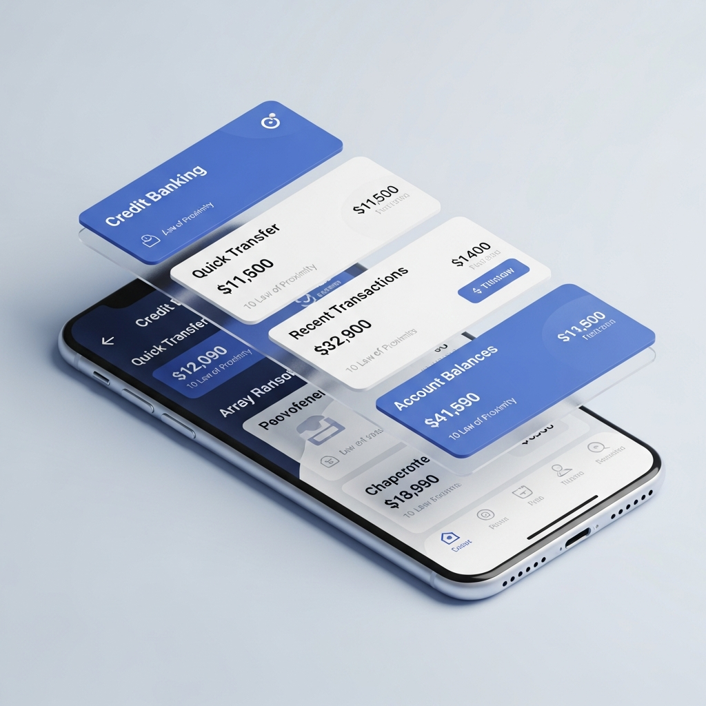
The 2026 Digital Branch is no longer a static collection of links. It is a modular, AI-driven environment that adapts to the member's current needs. Proximity is the glue that holds these modules together. Consider the following key areas of application:
1. Transactional Grouping
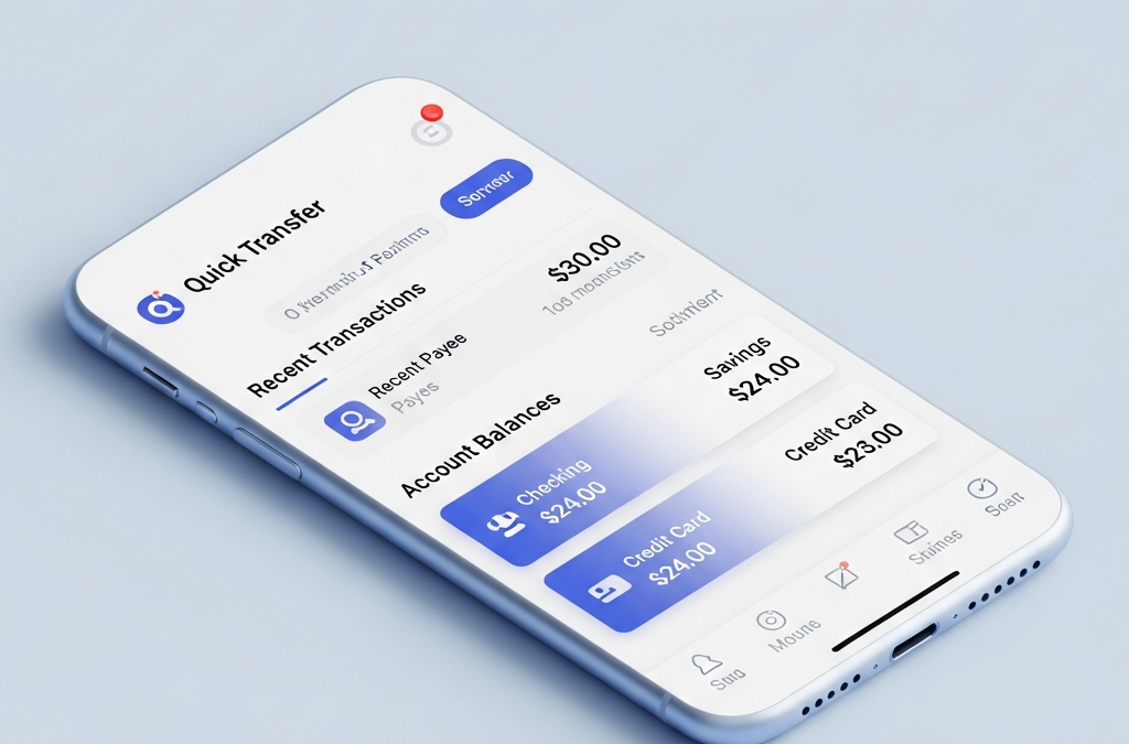
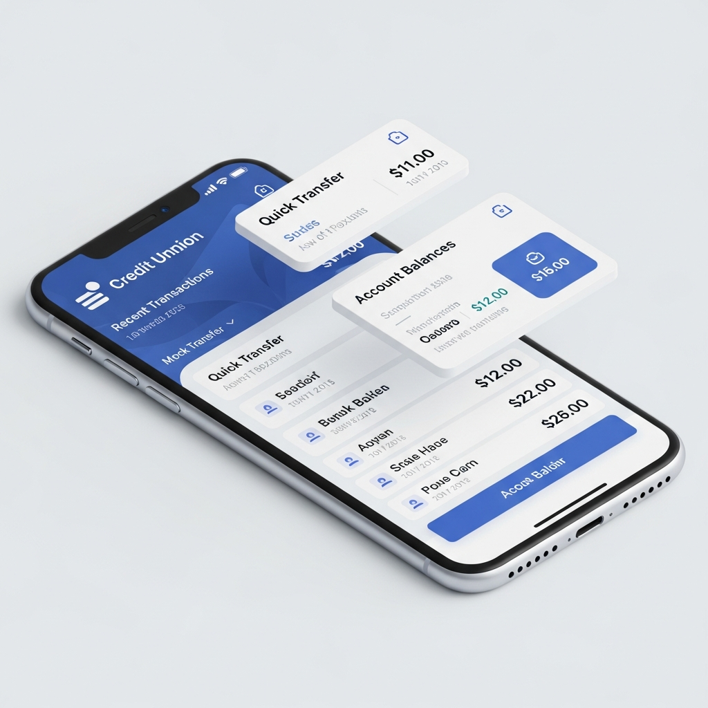
Modern banking apps must balance a massive amount of data. By applying proximity, designers can group "Actionable" elements (Pay Bill, Deposit Check, Send Money) separately from "Informational" elements (Current Balance, Available Credit). According to Laws of UX, grouping related functions helps users quickly identify what they can *do* versus what they need to *know*.
2. Secure Form Design
In loan application flows, proximity is critical for reducing errors. Grouping personal data fields (Name, Address, SSN) in one visual cluster and financial data (Income, Employer, Assets) in another prevents the member from feeling overwhelmed. Clusters create a sense of progress; completing one group feels like a "win," encouraging the member to proceed to the next.
3. AI-Driven Personalization
As AI begins to offer predictive insights—such as "You could save $200 by refinancing your auto loan"—these suggestions must be placed in close proximity to the relevant data (the current auto loan balance). If the suggestion is buried in a sidebar, it loses its context and relevance, appearing as intrusive advertising rather than a helpful member benefit.
Reducing Cognitive Load: The Scientific Case for Grouping
The "Gap" between a member's current financial stress and their desired security is where the Credit Union provides value. However, if the digital tools used to bridge that gap are themselves stressful, the relationship erodes. High cognitive load—the total amount of mental effort being used in the working memory—leads to decision paralysis and abandonment.
The Law of Proximity acts as a "pre-processor" for the human brain. By visually grouping information, we do the heavy lifting for the member. They don't have to think about which buttons belong to the credit card and which belong to the savings account; they *see* it. Research into visual organization suggests that users can identify related functions much faster when proximity is used to establish a clear hierarchy.
Proximity and the Conversion Funnel: Driving Loan Applications
For Credit Union executives, the ultimate metric is growth—specifically in loans and deposits. The conversion funnel from "Curious Member" to "Loan Applicant" is paved with UX decisions. Proximity plays a leading role in "Sales Pacing," a concept we've adapted from Jeremy Miner’s communication frameworks.
In a sales conversation, pacing involves controlling the delivery of information to build curiosity. In UI design, proximity does the same. By placing the "Calculate Your Payment" tool in close proximity to the "Current Rates" table, we create a logical next step. We aren't asking for the loan yet; we are just providing the tool to explore the possibility. This "Curiosity Pacing" keeps the member engaged without triggering the defensive "I'm being sold to" response. Once the member sees a favorable monthly payment, the "Apply Now" button—placed in immediate proximity—becomes the obvious, friction-less path forward.
The Architecture of Trust: How Grouping Signals Security
In the fintech world, design *is* security. If a website looks cluttered or disorganized, members subconsciously perceive it as less secure. This is where "Mirror Selling" (practicing confidence and energy) translates to UI. A confident interface is one that is clean, organized, and intentional.
Proximity signals professionalism. When security badges, FDIC/NCUA logos, and encryption notices are grouped together near the "Log In" or "Submit" buttons, they provide a visual "security blanket." This grouping reinforces the message that the member is in a safe environment. Conversely, if security icons are scattered randomly, they look like an afterthought, heightening member anxiety. By architecting trust through proximity, CUs can overcome the "Damaging Admissions" of being smaller than national banks by proving they are more detail-oriented and member-focused.
Implementation Roadmap for Credit Union Executives
How can your Credit Union leverage the Law of Proximity today? It requires a shift from "Manager" to "Maker" mindset, as advocated by Alex Hormozi. It's about spending money in the right places—tools and implementation help—to increase active income (member growth).
- Audit Your Mobile Landing Page: Are your core actions (Transfer, Pay, Deposit) grouped together in the "Thumb Zone"? If they are spaced too far apart, you are increasing physical and cognitive effort.
- Refactor Your Loan Forms: Use whitespace to create clear clusters of related questions. Avoid the "wall of inputs" that leads to abandonment.
- Group Promotional Content with Utility: Instead of a random banner for credit cards, place a small, high-proximity tip about "Earning 2% Cash Back" near the transaction list for a member's current checking account.
- Test the 'Squint Test': Squint your eyes while looking at your homepage. Can you still see distinct groups of elements? If it looks like one grey blob, your proximity is failing you.
Conclusion: From Information to Intuition
The Law of Proximity is why some credit union websites feel like a chore to use, while others feel like an extension of your own thoughts. In 2026, member loyalty is earned through the "Invisible UI"—design that works so well the member doesn't even notice it. By mastering visual grouping, your Credit Union can bridge the gap between complex financial data and intuitive member empowerment.
Don't let your digital branch be a collection of isolated parts. Architect it as a cohesive, high-velocity engine of growth. The future of banking isn't just about features; it's about the proximity of your solutions to your members' needs.
References
- Interaction Design Foundation: What is the Law of Proximity?
- Laws of UX: Gestalt Principles for UI
- Yarsa DevBlog: The Art of Visual Organization
- The Financial Brand: Re-igniting Credit Union Growth in 2026
- Gapsy Studio: Proximity Design Principle Guide
Every article from Credit Union Web Solutions is engineered for maximum SEO performance and member engagement.
This article was brought to you by GrafWeb CUSO – Building the future of digital credit unions.