📑 Table of Contents
- Introduction
- The Psychology of the Focal Point
- Why Credit Unions Struggle with Visual Hierarchy
- Architecting Conversion: Harnessing the Power of the Primary Action
- Digital Branch Application: Where to Place Your Focal Points
- The Role of AI in Predictive Focal Point Optimization
- ADA Compliance and Focal Points: Inclusive Design Strategy
- Conclusion
- References
Introduction
In the hyper-competitive financial landscape of 2026, a credit union's digital branch is no longer just a utility—it is the primary battlefield for member acquisition and retention. As fintech giants and mega-banks deploy increasingly sophisticated psychological frameworks to capture user attention, credit unions must evolve beyond static, "information-first" websites. The key to this evolution lies in the scientific application of UX laws, specifically the **Law of Focal Point**.
The Law of Focal Point states that whatever stands out visually will capture and hold the viewer's attention first. In the context of a credit union website, this isn't just about aesthetics; it's about engineering a "Digital Path of Least Resistance." If a member lands on your homepage and cannot immediately identify the single most important action they should take—whether that is opening an account, applying for a loan, or checking rates—your interface has failed.
The Psychology of the Focal Point
Human cognition is hardwired to seek shortcuts. In a digital environment, the brain performs a rapid "visual triage" to determine relevance. According to research on pre-attentive processing, certain visual stimuli—such as high contrast, unique shapes, or vibrant colors—are processed by the brain in less than 200 milliseconds, before the conscious mind even begins to "read" the page (Interaction Design Foundation, 2024).
For credit unions, this means that the "Apply Now" button isn't just a UI element; it's a physiological trigger. When we talk about architecting the 2026 digital branch, we are talking about managing cognitive load. By creating a clear focal point, we reduce the "choice paralysis" that often leads to high bounce rates in complex financial workflows.
Why Credit Unions Struggle with Visual Hierarchy
Most legacy credit union websites suffer from what we call "The Committee Effect." Every department—loans, mortgages, marketing, and member services—wants their promotion to be "above the fold." The result is a visual cacophony where nothing stands out because everything is trying to stand out. This is the antithesis of the Law of Focal Point.
As Alex Hormozi often notes in his marketing frameworks, the path to scaling demand is to remove friction (Hormozi, 2023). For a credit union, the ultimate friction is a confusing interface. If you are trying to sell everything at once, you are selling nothing. We must move toward "Strategic Scarcity" in our UI—only one primary focal point per screen, supported by secondary and tertiary elements that guide the eye toward that goal.
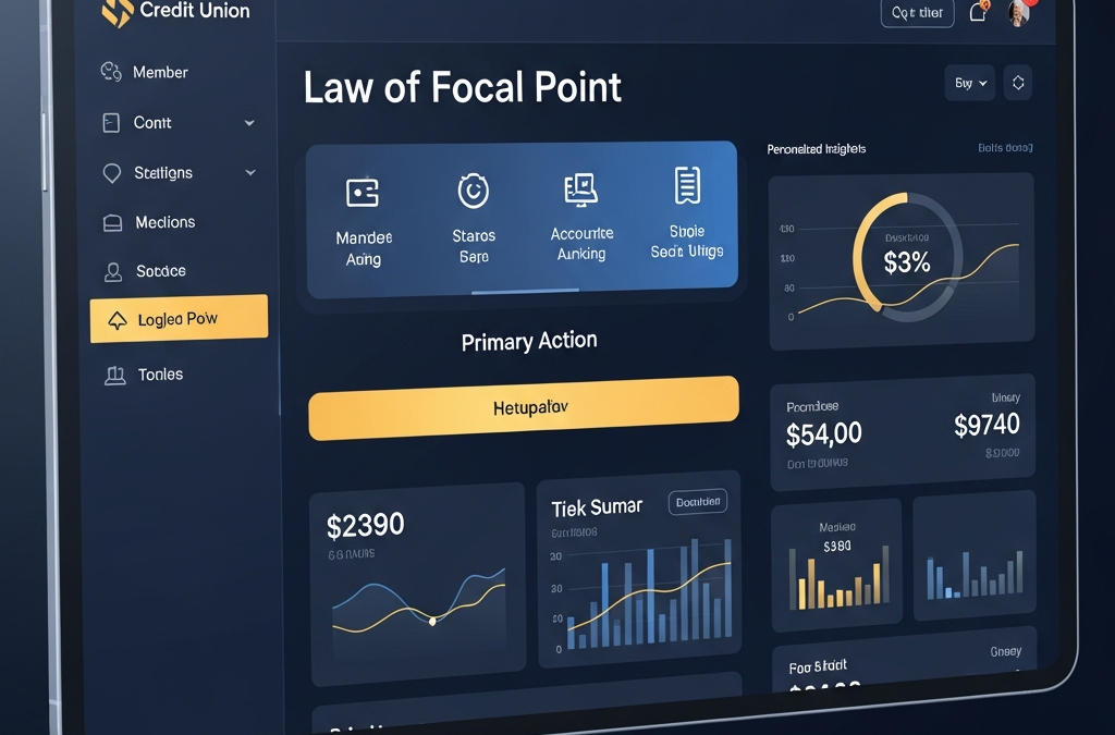
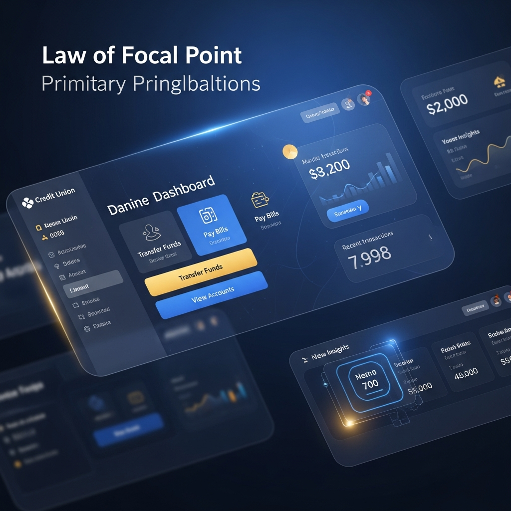
Architecting Conversion: Harnessing the Power of the Primary Action
To implement the Law of Focal Point effectively, designers must master three core visual levers:
- Contrast: Using a color that exists nowhere else in your brand palette for the primary CTA. For a brand using deep blues, a "Digital Gold" or "Vivid Teal" focal point creates an immediate visual anchor.
- Scale: The primary goal should be significantly larger or more "weighted" than surrounding elements.
- Whitespace: The most underutilized tool in credit union design. Surrounding a focal point with "negative space" increases its perceived importance and makes the interface feel premium and trustworthy.

Digital Branch Application: Where to Place Your Focal Points
Where should these focal points live? In 2026, the strategy is shifting from generalized homepages to "Intent-Specific Hubs."
- The Member Onboarding Flow: The focal point should always be the dynamic "Next Step" button, preventing the user from feeling overwhelmed by long forms.
- The Loan Calculator: The focal point shouldn't be the numbers—it should be the "Get Pre-Approved" button that appears as soon as a favorable rate is calculated.
- The Dashboard: Instead of showing all accounts at once, the focal point should highlight the most "actionable" item, such as a pending payment or a personalized savings recommendation.
The Role of AI in Predictive Focal Point Optimization
At GrafWeb CUSO, we are increasingly using AI to predict where a member's eye will land. Using heat-mapping algorithms and eye-tracking simulations, we can objectively measure the "Visual Salience" of a design before it ever goes live. This allows us to ensure that the credit union's strategic pulse—the membership application—is always the dominant focal point.
ADA Compliance and Focal Points: Inclusive Design Strategy
Crucially, the Law of Focal Point aligns perfectly with WCAG 2.2 accessibility standards. A clear focal point is also a clear focus indicator for keyboard users and those using screen readers. By designing for a strong visual focal point, we naturally create a more navigable structure for neurodiverse members and those with visual impairments, ensuring that the digital branch remains inclusive for all.
Conclusion
The Law of Focal Point is not a suggestion; it is a fundamental requirement for any credit union intending to survive the digital-first era of 2026. By ruthlessly prioritizing the primary member action through contrast, scale, and strategic design, credit unions can convert their websites from static brochures into high-velocity digital growth engines.
References
- Interaction Design Foundation (2024). Preattentive Visual Properties and How to Use Them.
- Nielsen Norman Group (2025). Visual Hierarchy in UX Design.
- Hormozi, A. (2023). $100M Leads: How to Get Strangers to Want to Buy Your Stuff.
- W3C (2025). Web Content Accessibility Guidelines (WCAG) 2.2 Overview.
This article was brought to you by GrafWeb CUSO – Building the future of digital credit unions.