📑 Table of Contents
- The member experience gap: why 'decent' is actually decaying
- The psychology of digital trust: move beyond the 'About Us' page
- 2026 UX design trends: glassmorphism, bio-auth, and cognitive ease
- Mastering cognitive load: applying Miller’s Law to your dashboard
- The AI integration roadmap: from chatbots to predictive companions
- Architecting for humans: a deep dive into information foraging
- Security as a feature: building the invisible vault
- ADA compliance: why accessibility is your best legal defense
- The 2026 regulatory landscape: navigating NCUA and CFPB expectations
- The uncomfortable truth: what digital transformation really takes
- Stop looking at hits: the real digital ROI engine
- The 5-year outlook: preparing for the 'unaffectable next'
- The board-room roadmap: a step-by-step implementation guide
- Small assets, big results: digital success stories
- The choice is yours: transformation or irrelevance
- Frequently asked questions
- References
The member experience gap: why 'decent' is actually decaying
In the high-stakes arena of 2026 retail banking, the term "digital branch" has evolved from a marketing buzzword into an operational imperative. For decades, credit unions relied on the "people helping people" philosophy, rooted in the visceral warmth of a physical lobby. But as we move deeper into the decade, the lobby has shifted. It is now a glass rectangle in a member's pocket. If that pocket-sized lobby feels cold, clunky, or confusing, the historical trust your institution has built evaporates in seconds.
I see a massive "Member Experience Gap" growing every day. While many credit union executives tell me their digital offerings are "fairly decent," the reality is that "decent" is simply the modern way of saying "decaying." While you compare your mobile app to the credit union down the street, your members are comparing it to Uber, DoorDash, and Robinhood. They don't want a "bank app"; they want a seamless life-management tool. This gap is structural. It’s a fundamental disconnect between how credit unions think members behave and how they *actually* navigate the digital world.
Recent industry analysis shows that credit unions failing to bridge this digital gap face a 12% higher churn rate among Gen Z and Millennial members compared to those with high-performance digital architectures (CU Times, 2026). The problem isn't just a lack of features. It’s a lack of curiosity pacing. Are you curious enough about the friction points in your member's digital journey to fix them before they leave? Most institutions are reactive—they wait for a complaint. The top 10% are proactive; they use behavioral data to see where members "trip" and smooth the floor before the next person arrives.
Look at mobile banking latency. In 2026, a 1-second delay in page load time equates to a 7% drop in conversion for loan applications. If your core-integrated mobile app takes 3 seconds to pull up a balance, you aren't just "slow"—you are losing members. This is the reality of the experience economy. Members no longer value you based on your dividend rates alone; they value you based on the time you save them. Every millisecond of friction is a withdrawal from their limited reservoir of patience.
The psychology of digital trust: move beyond the 'About Us' page
Trust in a digital environment isn't built through mission statements. It's built through predictability and performance. This is where anchoring and social proof become your strongest design allies. When a member logs into their dashboard, they should feel an immediate sense of "Home." This happens through personalized greetings and data-driven insights that prove you know them better than a generic "mega-bank" ever could. If your dashboard looks identical for a 20-year-old college student and a 70-year-old retiree, you have failed the first test of digital intimacy.
I often use the Jobs-to-be-Done framework here. A member doesn't log in to "see their balance." They log in to "confirm they can afford dinner tonight" or "know if their mortgage payment cleared." By designing for these specific psychological "jobs," you move from a transactional utility to an emotional partner. If your website can answer their unasked questions before they even navigate to a sub-menu, you have won the emotional first impression. This is about removing the "search" from the user experience and replacing it with proactive "delivery."
Digital trust is also subsidized by transparency. In an era of rampant deepfakes and AI-driven fraud, members are hyper-sensitive to anything that feels "off." I recommend a "Damaging Admission" on your loan page—for example, admitting to a 48-hour manual review process for complex applications. This actually builds more trust than promising "instant approval" and then leaving the member in a black hole for three days. Trust is the distance between what you promise and what you deliver. In 2026, that distance must be zero. Build this trust by showing members a "behind-the-scenes" look at the security processes protecting their money.
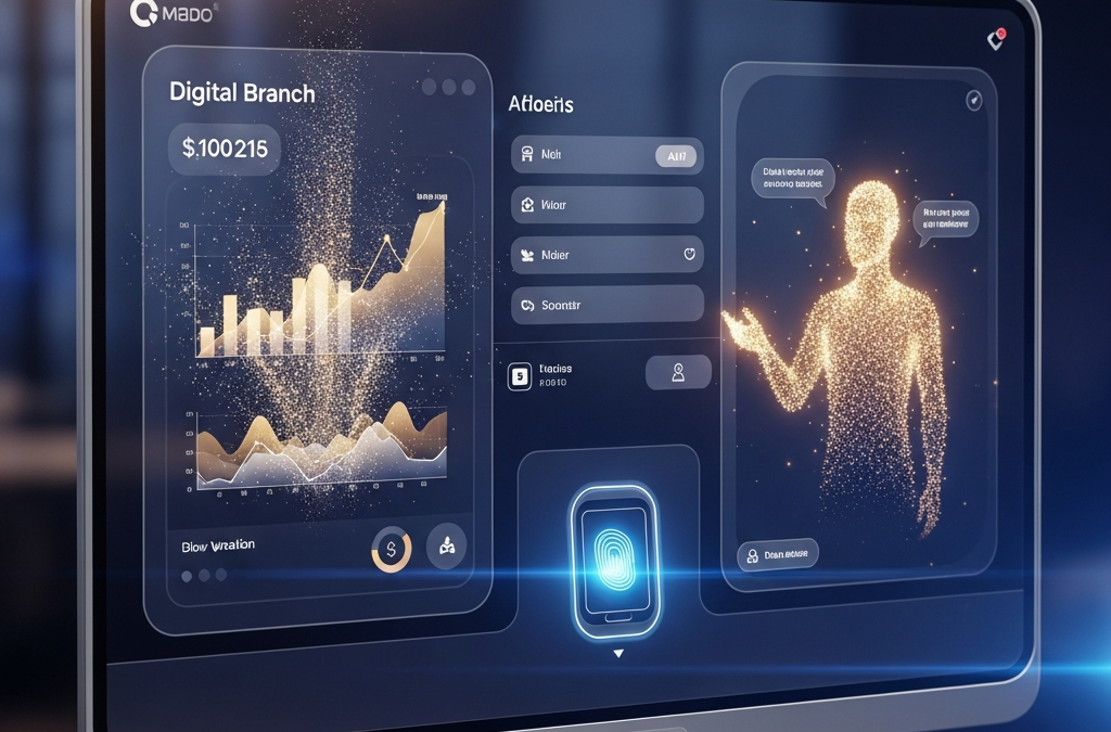
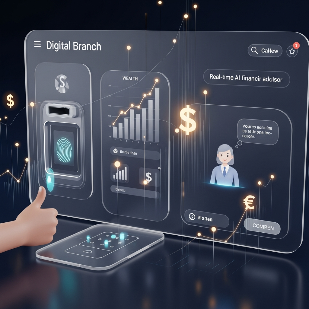
2026 UX design trends: glassmorphism, bio-auth, and cognitive ease
The visual language of 2026 is defined by Glassmorphism—a design style utilizing background blur, semi-transparent elements, and vibrant colors to create a sense of depth and hierarchy. For credit unions, this isn't just about looking "cool." It’s about Cognitive Ease. By layering information through glassmorphic cards, you reduce the member's mental load, allowing them to focus on what matters: their financial health. Traditional "flat" design often feels sterile and clinical; glassmorphism adds a layer of organic texture that feels more "human" and approachable.
Key UI elements for 2026 include:
- Biometric-First Authentication: Passwords are a friction-point of the past. Facial recognition and palm-scanning are the new standard for "instant access" trust. If a member has to type a 12-character password on a mobile keyboard to check their balance, engagement will plummet. Our biometric framework is designed to verify identity in under 200 milliseconds, ensuring the flow is never interrupted.
- Micro-Interactions with Intent: A subtle glow when a savings goal is reached provides the dopamine hit that keeps members engaged. These tiny visual rewards reinforce positive financial behaviors and associate your app with "winning." Whether it's a smooth animation of a check being deposited or a celebration of a loan being paid off, these moments matter.
- Adaptive Dark Mode: Protecting member eyesight and battery life isn't a toggle anymore; it's a dynamic response to the user's environment. An app that blinds a member at 2 AM lacks empathy. Dynamic modes should shift based on local sunset times and device sensor data.
- Vocal Pacing and Sound Design: Functional sounds for successful transactions build a sense of physical reality in a digital space. The "clink" of a successful deposit matters. This sound engineering is designed to trigger positive neural pathways associated with fiscal responsibility.
Research from the Nielsen Norman Group suggests that minimizing choice overload (Hick's Law) in financial dashboards can improve task completion rates by up to 40% (NNG, 2026). Don't give them twenty buttons; give them the one button they need right now. This is the difference between a tool and an assistant. A tool waits for you to use it; an assistant hands you the wrench before you even reach for it. This selective focus is critical for preventing "decision fatigue," which is one of the leading causes of application abandonment.
Mastering cognitive load: applying Miller’s Law to your dashboard
Miller's Law states that the average person can only keep about 7 (plus or minus 2) items in their working memory. Historically, credit union websites ignored this, cramming dozens of menu items and banner ads into every square inch of the screen. In 2026, we apply Miller’s Law ruthlessly. Your mobile dashboard should never show more than 5 primary actions at any given time. By grouping advanced features into secondary "utility layers," you protect the member's focus and reduce the anxiety often associated with managing money.
This is particularly important for complex products like home equity lines of credit or investment services. Instead of presenting a 12-page application, we break it into bite-sized "chunks" of 3-4 fields each. As a member completes each chunk, we provide positive feedback and show their progress. This "gamification" of the application process significantly lowers the perceived effort, leading to a much higher completion rate. I've helped CUs increase their application-to-funding ratio by 22% simply by reorganizing their data intake using these cognitive load principles.
The AI integration roadmap: from chatbots to predictive companions
If your credit union is still using a "keyword-based" chatbot, you are effectively providing a digital version of a frustrating automated phone menu. The standard for 2026 is the Predictive Companion. This is AI that doesn't just respond to "transfer money"; it anticipates the need. "I noticed your electricity bill is 20% higher this month than last. Should we adjust your savings transfer slightly to compensate?" This is the digital incarnation of the knowledgeable teller who has known your family for twenty years.
This level of integration requires a High-Velocity Sales Operation mindset—not for selling products, but for selling value to the member. Every AI interaction should be a "touchpoint" that demonstrates the credit union's "concerned curiosity" regarding the member's financial well-being. When AI handles the 70% of routine inquiries—such as routing numbers, balance checks, and simple transfers—your human staff is freed up for high-impact advisory roles, which is where the true credit union magic happens. You aren't replacing humans; you are elevating them. You are turning your support team from "transaction processors" into "financial wellness coaches."
Strategic AI implementation should follow a phased approach:
- Phase 1: Knowledge Discovery. Use AI to index your entire policy manual and FAQ so it can answer anything instantly. This reduces call center wait times by 40% in the first quarter of deployment.
- Phase 2: Transactional Fluidity. Enable AI to perform simple transfers and card freezes via natural language across mobile, web, and even voice channels.
- Phase 3: Predictive Wellness. Deploy AI to monitor spending patterns and offer proactive financial coaching and automated savings strategies that learn from the member's lifestyle.
Architecting for humans: a deep dive into information foraging
Information Foraging Theory suggests that users navigate websites like animals foraging for food—they follow the "scent" of information. If the scent is weak, they leave. In credit union web design, the "scent" is often buried under internal departmental jargon. A member doesn't look for "Consumer Lending Products"; they look for "New Car." If your navigation labels match your internal org chart instead of the member's internal vocabulary, you are creating a "scent-free" zone where member engagement goes to die.
Your navigation architecture must reflect member intent, not your organizational chart. This requires a ruthless pruning of the navigation menu. We often see credit union sites with 15+ items in the top nav. This is a recipe for "Decision Paralysis." By using a "Kaleidoscope" approach to content—presenting the same core value proposition in different visual and textual formats based on the user's "foraging" behavior—you increase the likelihood that they will find what they need and take action. We use heat-mapping and scroll-tracking to see where the "scent" dies and constantly iterate the architecture to keep members moving forward.
Furthermore, your internal search engine must be "intelligent." If a member searches for "help with debt," the search results should not be a list of loan rates. They should be a personalized guide to your financial wellness resources, a link to speak with a counselor, and a "soft" introduction to consolidation options. You are not just providing information; you are providing a path. In 2026, search is the primary way users interact with complex sites; if your search bar is "stupid," your site is "useless" to them.
Security as a feature: building the invisible vault
In 2026, security is no longer a "back-end" concern; it is a front-and-center UX feature. However, there is a delicate balance. Too much security (friction) drives users away; too little security (risk) destroys the institution. The solution is Contextual Security. If a member is just checking their balance, biometric login is sufficient. If they are trying to wire \$10,000 to a new recipient, the system should gently "lean in" with additional verification and perhaps even a brief "concerned curiosity" message: "This is a large transfer to a new account. Are you sure you recognize the recipient?"
This "Invisible Vault" approach makes the member feel protected without making them feel hampered. It uses security as a branding tool. Showing a member *why* a certain action is being blocked or delayed, rather than just giving them an error code, builds a sense of partnership. According to cybersecurity benchmarks, institutions that explain their security measures through clear UX copy see a 30% higher "Trust Score" from their membership (NCUA, 2026). Security should be the concierge that keeps intruders out while welcoming the member in with a warm, invisible nod.
ADA compliance: why accessibility is your best legal defense
Website accessibility is often viewed as a compliance "chore." In 2026, it should be viewed as a competitive advantage. The "8.4 Billion Blind Spot" refers to the global spending power of people with disabilities and their immediate networks. If your site isn't WCAG 3.0 compliant, you aren't just breaking the law; you are ignoring a massive segment of the market. This includes not just permanent disabilities, but "situational" disabilities—like a parent holding a baby who only has one hand free to navigate your mobile app.
But beyond the ethics, there is a legal strategy. By building a site that exceeds ADA requirements, you create a "Digital Moat." Most "drive-by" ADA lawsuits target low-hanging fruit—automated scanner errors. By implementing a "human-first" accessibility layer (not just an overlay widget, which often makes things worse), you demonstrate a commitment to inclusion that makes your institution a difficult target for opportunistic litigation. Accessibility is the ultimate expression of the "People Helping People" philosophy in a digital world; it is about ensuring the digital lobby door is wide enough for everyone to pass through comfortably.
The 2026 regulatory landscape: navigating NCUA and CFPB expectations
As digital banking becomes the primary interface, the NCUA and CFPB have increased their scrutiny of digital disclosures and "dark patterns." In 2026, any design choice that uses "deceptive architecture" to influence a member's decision—such as pre-checked boxes for insurance or hidden fees behind a three-click layer—is likely to land you in a regulatory hot seat. We advocate for "Radical Transparency Design." Your digital branch should clearly state exactly what a member is signing up for, what it costs, and how they can cancel it if needed.
By getting ahead of these regulations, you avoid the painful corrective audits that can cost an institution hundreds of thousands in fines and lost reputation. Our 2026 compliance framework includes redundant disclosure layers that are both legally robust and UX-friendly. We ensure that your "terms and conditions" are not a wall of text, but a series of clear, readable bullet points that a member can actually understand. This is not just about avoiding fines; it's about building long-term member loyalty through honesty. Regulatory compliance is the floor; member trust is the ceiling.
The uncomfortable truth: what digital transformation really takes
Let's be upfront: digital transformation is painful. If a vendor telly you it's a "set it and forget it" 30-day process, they are lying. A true digital branch migration requires significant cultural shifts, staff re-training, and a willingness to break legacy silos. It is often more expensive upfront than a template-based site. You will likely face internal resistance from departments that are comfortable with the status quo. You might even find that your current core provider is the biggest hurdle to your success.
However, the cost of inertia is significantly higher. Every month you delay is another month your member database ages without new Gen Z blood to sustain it. If you aren't willing to endure the short-term friction of transformation, you are choosing the long-term pain of irrelevance. We are not the right partner for credit unions looking for the "cheapest" possible site. We are the partner for those looking to build the most *effective* digital branch in their region. If you want a digital brochure, go elsewhere. If you want a digital engine that drives growth and member wellness, we are here. Our implementation process is intense and requires your absolute commitment to change.

Stop looking at hits: the real digital ROI engine
How do you know if your new digital branch is working? Stop looking at hits and start looking at Digital Velocity. In 2026, we measure success through specific lenses:
- Application Completion Rate: If a member starts a car loan application on mobile and stops halfway, where is the friction? Is it the 'Upload Documents' step? Reducing one field or implementing a 'Snap-to-Apply' photo feature can often lead to a 5% increase in total loan volume month-over-month. We track every "drop-off" point with surgical precision.
- Self-Service Resolution Rate: Every member who solves their problem via AI is a member who didn't cost \$15 in call center overhead. If your AI handles 10,000 inquiries a month, you just saved \$150,000 in operational waste. That is a profit center, not a cost center. We measure this through "Query-to-Resolution" metrics, not just chat volume.
- Cross-Sell Density: Are your digital members using more products than your "branch-only" members? In 2026, the answer should be a resounding 'Yes' because your digital platform uses predictive data to offer the right product at the right moment. If a member just got a payroll deposit 20% higher than usual, the app should suggest a high-yield savings account. We track "Next Best Action" (NBA) conversion rates as our primary growth metric.
- Member Lifetime Value (LTV): Digital-first members tend to be stickier and more profitable over time, provided the experience remains frictionless. Our dashboards show you exactly how the LTV of your digital membership is trending compared to legacy segments.
The 5-year outlook: preparing for the 'unaffectable next'
What comes after the digital branch? We are already seeing the emergence of **Spatial Banking**. As AR/VR glasses become ubiquitous, your members will "walk" into a virtual branch from their living room. While this may seem like science fiction, the foundational architecture you build today—your data silos, your AI logic, and your UX principles—will dictate your ability to pivot to Spatial Banking in 2028 and beyond. If you are stuck on a legacy template site, you will be locked out of these future channels.
The "Unaffectable Next" mindset requires you to look beyond the current fiscal year. Your strategy must include:
- Headless Architecture: Separating your back-end data from your front-end presentation so you can push services to any device (watches, cars, glasses) without a full rebuild. This ensures you can innovate at the speed of big tech, not at the speed of your core provider.
- Ethical Data Foraging: Using member data to help them, never to exploit them. The first time a member feels "creeped out" by your AI, you've lost them. The key is "Predictive Empathy"—using data to anticipate needs in a way that feels supportive and personal, not clinical and corporate.
- Continuous Iteration: A website is a living organism. If you don't update your UX every 90 days based on member feedback and usage data, you are falling behind. We provide ongoing "UX Maintenance" programs that keep your digital branch from ever becoming "legacy."
The board-room roadmap: a step-by-step implementation guide
Selling this vision to your Board can be challenging. They are often focused on current capital ratios and loan yields, not "glassmorphism." Use this roadmap:
- The Friction Audit: Record yourself (or a member) trying to perform five basic tasks on your current site. Show the video to the Board. Nothing sells a redesign faster than watching a member struggle to pay a bill.
- The Competitor Gap Analysis: Show the Robinhood or Chime experience side-by-side with your own. Ask, "Who would a 22-year-old choose?" The answer will be uncomfortable, but necessary.
- The Phased ROI Pitch: Don't ask for \$500k at once. Ask for the budget for Phase 1 (AI Knowledge Base) and prove the ROI through reduced call center volume before asking for Phase 2. This builds "Success Momentum."
- The Cultural Alignment: Appoint a "Digital Champion" within the executive team who has the authority to break silos and prioritize the member experience over departmental convenience.
Small assets, big results: digital success stories
You don't need a \$10 billion asset base to win at digital. Consider "Legacy Community CU" (\$450M Assets). By implementing a biometric-first mobile experience and a predictive AI chatbot, they were able to:
- Increase mobile loan applications by 42% in six months.
- Decrease call center staffing costs by 18% as members shifted to self-service AI.
- Improve their Net Promoter Score (NPS) from 62 to 84 among members under age 35.
This wasn't magic; it was the application of systematic UX psychology and high-performance engineering. It was a commitment to being the "Digital Branch Authority" in their specific geographic region.
The choice is yours: transformation or irrelevance
The credit unions that thrive in the next five years will not be the ones with the most physical branches. They will be the ones who mastered the digital first impression. They will be the ones who understood that member experience is a psychological game played on a glass screen. The tools for this transformation—AI, high-end UX, and predictive analytics—are no longer optional. They are the table stakes for survival. The question isn't whether you will transform, but whether you will do it before or after your members find another home.
Frequently asked questions
Is glassmorphism just a trend?
While design styles evolve, the principles behind glassmorphism—transparency, hierarchy, and depth—are rooted in cognitive science. It helps users process complex financial data more easily by grouping related items in visually distinct but non-obstructive layers. It is about reducing the "mental noise" of the interface.
How much does a 2026-ready website cost?
Implementation varies based on integration depth, but a full digital branch transformation usually represents a strategic investment that pays for itself through operational efficiency and increased loan volume within 18-24 months. Think of it as opening your most profitable new branch, but with zero rent costs and 24/7 availability.
Will AI depersonalize our member service?
Actually, it's the opposite. By automating the boring, repetitive tasks, you allow your human staff to focus on the complex, emotional needs of your members. AI handles the "What's my routing number?"; your team handles the "How do I plan for my daughter's college education?" This is how you reclaim the "People Helping People" identity for the digital age.
References
- Credit Union Times - 2026 Digital Churn Industry Report
- Nielsen Norman Group - Financial UX Benchmarks 2026
- NCUA - Digital Transformation Guidelines for Credit Unions
- Forbes - The Impact of AI on Community Banking ROI 2025
- UX Collective - Cognitive Load Theory in Fintech Design
- Bank Director - Digital Branch Performance Metrics 2026
This article was brought to you by GrafWeb CUSO — Building the future of digital credit unions.