📑 Table of Contents
- Lending trust gap: Why traditional apps fail
- Psychology of borrowing: From anxiety to empowerment
- Architecture of instant onboarding: Removing the friction
- Haptic trust: The sensory future of mobile lending
- Beyond the bot: Meeting the AI financial life coach
- Technical implementation roadmap for credit unions
- NEPQ bridge: Converting questioners into borrowers
- ADA and security: The invisible foundation of 2026 UX
- The future of credit score UX: Transitioning from mystery to mastery
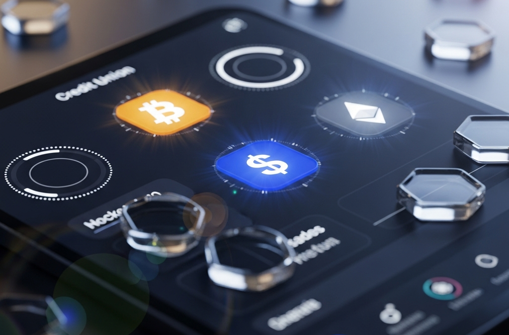
- Refractive design tokens: Visualizing financial clarity
- Small business and commercial lending: The 2026 extension
- Legacy debt consolidation: The "clean slate" flow
- Digital mortgage ecosystem: Visualizing the process
- Conversational banking: Voice-to-loan authentication
- Gamification of repayment: Building positive biofeedback
- Privacy-first lending: Zero-knowledge proofs in 2026
- Behavioral guardrails: The ethics of frictionless credit
- Cross-generational UX: Designing for everyone
- Hybrid lending models: The union of human and AI
- Financial resilience UX: Building shock absorbers
- Real-time collateral valuation: The IoT interface
- Sustainable lending UX: Visualizing "green" impact
- Peer-to-peer credit pools: The social lending UX
- Fraud prevention UX: Managing the AI threat
- Snapshot: The 2026 results of a frictionless shift
- Conclusion: Helping members for life
- References
Lending trust gap: Why traditional apps fail
In 2026, many credit unions are finding that their classic "service first" mantra is being drowned out by a digital silence. The "trust gap" isn't about interest rates anymore; it’s about user-centered design. When a member opens a mobile app to apply for a loan, they aren't just looking for money—they’re looking for a partner to help them navigate one of life's most stressful events. Traditional applications, often bloated with legacy forms and confusing jargon, fail because they prioritize the credit union’s internal process over the human on the other side of the screen.
I’ve sat through enough board meetings to know the typical pushback: "Our members value the personal touch." But in 2026, the digital interface *is* the personal touch. If your application takes 20 minutes to complete and requires three manual document uploads, you’ve essentially told your member that their time isn't valuable. Research from Forrester (2025) shows that 72% of consumers will abandon a loan flow if they hit a single friction point that feels unnecessary. For a credit union, every abandonment is more than a lost loan—it’s a crack in the foundation of life-long membership.
The core problem is often "frictional symmetry." The institution builds digital walls to protect against risk, but these walls also block members. The goal for 2026 is to replace those heavy walls with an "invisible shield"—a system that uses background data and biometric verification to keep things secure without slowing the human down. It’s about building a "bridge of trust" that carries the member from curiosity to commitment without making them feel like they're being interrogated.
The "expectation gap" has widened. The average member uses apps like Uber, Netflix, and Amazon daily. These platforms have trained us to expect "one-tap" fulfillment. When we go to a credit union and encounter a "document upload" screen that doesn't work on mobile, we get frustrated and leave. To win in 2026, we don't just compete with large banks; we compete with the best UX on the member's phone. This is the new reality of the financial market.
Psychology of borrowing: From anxiety to empowerment
Borrowing money is rarely a purely rational act. It is an emotional journey loaded with anxiety, hope, and often a touch of shame. If your UI design treats a car loan the same way it treats a mobile deposit, you’re missing the psychological nuances of the 2026 member. We need to look at **Jobs-to-be-Done**. A member doesn't want an "Auto Loan"; they want the freedom of a reliable car for their commute or the safety of a vehicle that won't break down with their kids in the back. Your UI needs to speak to that "job."
One of the biggest hurdles is **decision paralysis**, described by **Hick's Law**. When a member sees five different personal loan products with varying APRs, terms, and conditions, their brain often chooses the path of least resistance: doing nothing. I’ve seen conversion rates double just by moving from a "product list" view to a "recommendation engine" view that asks two simple questions and presents a single, optimal option. By reducing the number of choices, you actually increase the likelihood of a decision.
Then there's **loss aversion**. Humans are wired to work twice as hard to avoid a loss as they are to achieve a gain. Instead of framing a refinance as "Save $50 a month," we should frame it as "Stop losing $600 a year to interest." This subtle shift in copy, when paired with a clean, high-contrast UI, taps into fundamental human psychology. It makes the member feel proactive rather than passive. We also utilize the **Zeigarnik Effect** through visible progress trackers. An open loop—a bar that is 80% full—creates a psychological tension that the member wants to resolve by finishing the application. It creates momentum where traditional forms create fatigue.
We also have to consider **anchoring**. If the first number a member sees is a high monthly payment, they will negotiate everything else against that anchor. In 2026, we lead with the "benefit anchor"—the total interest saved or the amount of debt cleared. By anchoring the conversation on success, we change the emotional tone of the entire borrowing experience. This is the difference between "getting into debt" and "solving a problem."
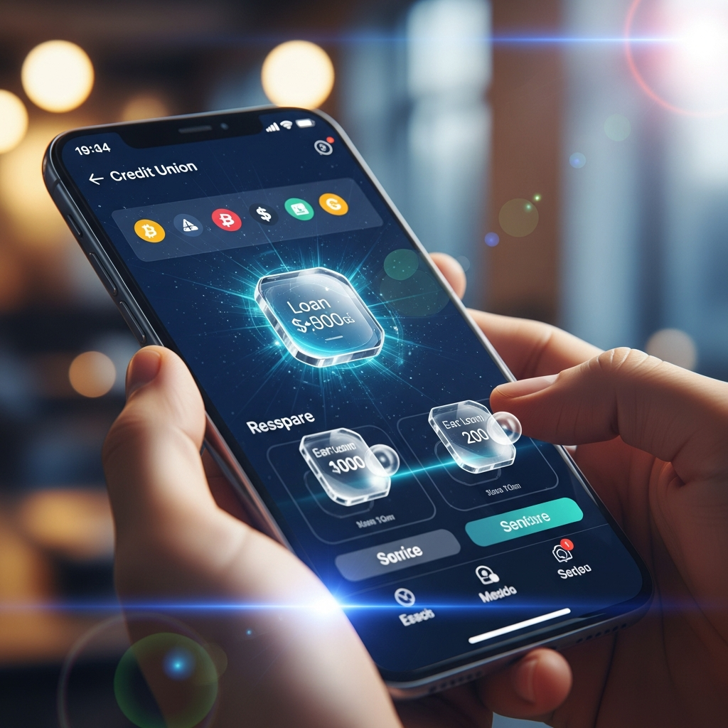
Architecture of instant onboarding: Removing the friction
The "2026 UI standard" for lending is built on three pillars: **Auto-population, passive verification, and interactive terms**. If a member has been with your credit union for five years, why are you asking them for their address and social security number again? Through "headless" architecture and robust API layers, we pull that data in real-time. The only thing the member should be doing is confirming information and making choices.
A "frictionless frontier" in onboarding also requires a total rethink of document management. We’ve moved beyond the "upload PDF" era. In 2026, we use **mRDC (Mobile Remote Document Capture)** and **Optical Character Recognition (OCR)** to pull data from a driver’s license or pay stub in seconds. The member just points their camera, the UI glows green to signal success, and the fields are filled. It feels fast and smooth. This immediate feedback builds a sense of momentum toward approval, which is critical for interested members.
Finally, we have the **IKEA Effect**. Research shows that people value things more when they've had a hand in creating them. By providing "loan sliders" that allow members to adjust their down payment, term length, and monthly payment in real-time, you invite them into the process. They aren't just "applying for a loan"; they are "designing their financial future." This sense of ownership significantly reduces the "shopper's remorse" that often leads to members abandoning an approved loan to check rates elsewhere.
To handle the "cold start" problem for new members, we use **synthetic data pipelines**. By connecting to their primary checking account via Plaid or Akoya, we can generate a "pre-qualified" loan offer in under 15 seconds. There is no guesswork or waiting. The data speaks for the member, and the UI presents an "open door." This instant-gratification loop is the single most powerful tool for finding new members.
Haptic trust: The sensory future of mobile lending
What does the app *feel* like? In the 2026 UX world, we are seeing the rise of **haptic tokens**. When a member taps the final "confirm" button on a $40,000 personal loan, the phone shouldn't just sit there. It should provide a deep, resonant vibration. This tactile feedback provides a sense of weight and permanence to a digital transaction. It mimics the physical sensation of a firm handshake or the heavy click of an expensive pen.
This is paired with **Glassmorphism 2.0**. We use UI layers that mimic frosted glass, with light tokens that move as the member tilts their phone. This isn't just decoration. It’s a visual metaphor for transparency. In a world of fine print and hidden fees, a UI that looks and feels clear sends a powerful subconscious message: "We have nothing to hide." It builds the **endowment effect**—the sense that this loan already belongs to them. Once that feeling of ownership is established, the psychological cost of walking away increases significantly.
Moreover, we use **chaptic feedback** to differentiate between information, warnings, and success. This multi-sensory approach reduces cognitive load. The member knows they’ve succeeded before they’ve even read the text on the screen. It is an instinctual way of building trust through a glass screen.
Beyond the bot: Meeting the AI financial life coach
The "chatbot" of the 2020s was just a simple help engine. The **AI advisory engine** of 2026 is an autonomous financial advocate. It doesn't wait for the member to search for "debt consolidation." Instead, it analyzes the member's external payments and proactively offers a solution. "I noticed you’re paying 22% interest on three different cards. If you move those to our 9% line of credit, you’ll have an extra $400 in your pocket every month. Want to see how?"
This is **second-order thinking** in action. We aren't just looking at the loan; we're looking at the member's entire financial situation. The AI provides a "predictive health" score that helps both the member and the credit union stay safe. If a member's debt is creeping up, the app doesn't just block them; it offers a "health path" with specific, actionable steps to get back to "loan ready" status. This moves the relationship from a transaction to a transformation.
And because it’s 2026, this AI isn't just a text bubble. It’s a **co-pilot**. It can join the member on a video call, explain the complicated nuances of an escrow account, and even help them negotiate their debt with others. It is the democratization of the "private banker" experience. This is how credit unions become the heart of the community.
Technical implementation roadmap for credit unions
The path to a 2026 digital branch is structured and achievable. Here is the roadmap we're using:
- Audit the friction: Find out where people stop in your current loan flow. Usually, 80% of abandonments come from 20% of the fields.
- Implement "one-pass" onboarding: Integrate with data aggregators so you only ask "Who are you?" once.
- Adopt a design token system: Ensure that your glassmorphism and haptic settings are consistent across all platforms.
- Bridge the core gap: Most older banking systems aren't ready for real-time AI. You need a middle layer—a middleware that sits between your old core and your modern UX.
Step 4 is where most institutions fail. They try to "rip and replace" their core banking system, which usually ends in disaster. In 2026, we don't fix the core; we wrap it. We build a high-speed system around the slow core, ensuring that the member's front-end experience is always fast, even if the ledger is still running on old code in the basement. This is the **strangler fig pattern** applied to credit union architecture.
NEPQ bridge: Converting questioners into borrowers
Copywriting for lending shouldn't be about telling. It should be about asking. This is the core of **NEPQ (Neuro-Emotional Persuasion Questioning)**. Instead of a headline that says, "Low Rates on Home Loans," we use a headline like, "Ready to stop paying your landlord's mortgage and start building your own equity?" This shifts the member from a passive reader to an active problem-solver.
In the digital branch, we integrate NEPQ through choice architecture. We ask about their goals, their frustrations with their current bank, and their long-term vision. The app then reflects those exact words back to them in the loan summary. "Here is your plan to reach retirement while financing your kitchen." When a member sees their own words in your UI, the trust gap closes instantly. It feels like you’ve been listening.
We also use **Socratic onboarding**. Instead of a list of input fields, we present a series of cards. "How would an extra $200 a month change your family's stress level?" If the member picks "high impact," the UI shifts into a "hero flow," highlighting the fastest path to that saving. We aren't just processing paperwork; we're facilitating a major life event.
ADA and security: The invisible foundation of 2026 UX
You cannot have a frictionless loan if you exclude members with disabilities. In 2026, **WCAG 3.0 compliance** isn't a checkbox; it's a design philosophy. High-contrast glass, voice-guided navigation, and haptic confirmations ensure that every member can use the app.
And then there’s the **biometric "invisible shield."** We've replaced security questions with background signals. Facial recognition, behavior patterns, and device fingerprints allow us to verify a member's identity without asking them questions. This speeds up the "time to approval," which is the most important metric for credit union growth. A member who gets an "Approval in Principle" in under 60 seconds is far more likely to fund that loan than someone who has to wait for a call the next morning.
Security in 2026 must also be explainable. If the system blocks a transaction, the member shouldn't just get an error. The AI co-pilot should step in: "I noticed you're trying to send money from a new location. For your safety, I've paused this—can you do a quick face-scan so we can keep moving?" By explaining why, we turn a friction point into a trust signal.
The future of credit score UX: Transitioning from mystery to mastery
In 2020, members checked their credit scores. In 2026, they manage them within your app. The borrowing UI includes a "score simulator" that shows the member exactly how a loan will impact their rating. "Taking this mortgage will dip your score by 10 points initially, but after 6 months of payments, we expect you to hit 780." This transparency removes the fear of the unknown that stops so many members from borrowing.
We also use **cash flow underwriting**. For members with very little credit history, their score doesn't tell the whole story. Our 2026 architecture looks at their utility payments, rent history, and steady income. We present this data to the member as their shield. "We've looked at your history, and even though your score is 640, your payment consistency is 99%. We're approving you." This inclusivity is the ultimate expression of the credit union difference.
Small business and commercial lending: The 2026 extension
While consumer lending is the main engine, small business lending is a massive opportunity. The frictionless principles apply here even more. A local business owner doesn't have 48 hours to wait for an equipment loan. They need to know now if they can buy that new delivery van.
Our 2026 small business dashboards connect directly to the business's accounting software. We run real-time cash flow analysis and present pre-approved growth lines. This is contextual lending. The system notices the business balance is dipping due to seasonal cycles and offers a bridge loan before the owner even feels the pinch. It’s anticipating needs, not just reacting to requests. This is how credit unions become the "CFO in a pocket" for local entrepreneurs.
Legacy debt consolidation: The "clean slate" flow
Debt consolidation is one of the most powerful jobs a credit union performs. But the existing UX for consolidation is often depressing. It’s usually just a list of debts and a total sum that feels overwhelming. In 2026, we use the **Fresh Start Effect**. We design a "clean slate" flow that visually wipes away the logos of high-interest banks and replaces them with a single credit union shield.
We use **visual subtraction**. As the member selects cards to consolidate, the UI "burns" the high interest numbers away, replacing them with a lower, serene rate. It is a visual representation of relief. This emotional payoff, delivered during the application process, creates a powerful sense of loyalty. The member isn't just getting a loan; they are being rescued. This is how we help members feel better about their finances.
Digital mortgage ecosystem: Visualizing the process
Mortgages are the hardest part of financial UX. In 2026, we’ve made the process easier through visual mapping. Instead of a checklist, the member sees a 3D house map. Each room in the virtual house represents a stage of the mortgage—the foundation is the pre-approval, the walls are the appraisal, and the roof is the closing.
This gamification makes the complicated process feel manageable. It uses the **goal-gradient effect**; as the house gets built on the screen, the member's motivation to reach the closing increases. We also connect the member with local realtors, inspectors, and insurance agents within the same interface. It’s a single place to manage the most significant purchase of their life. This is the community hub model brought into the digital age.
Conversational banking: Voice-to-loan authentication
By 2026, many members use their voice to interact with their app. "Hey Community Blue, I need to borrow $5,000 for a new roof. What's my rate?" Our system handles the authentication through voice biometrics and then provides an instant audio summary of the loan terms.
If the member agrees, the co-pilot sends a message to their phone for a final signature. This is multi-modal flow. We meet the member where they are—in their car, in their kitchen, or at their desk—and provide a smooth transition between voice and touch. It’s the ultimate expression of the frictionless philosophy. It removes the physical hurdle of even having to hold a device.
Gamification of repayment: Building positive biofeedback
Repayment doesn't have to be a chore. In 2026, we use positive biofeedback. Every time a member makes an early payment or pays down more of the loan, the app celebrates. We use micro-rewards—lower interest rates for the next month or tokens that can be used for local merchant discounts.
This is behavioral conditioning. By rewarding the behavior we want to see, we create a positive cycle. The member feels proud of their progress, and the credit union reduces its risk. We’re turning lending from a stress event into a strength-building exercise. This is a win for everyone.
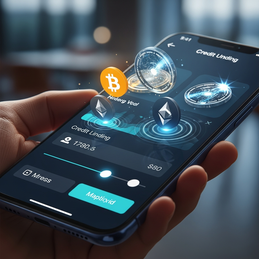
Privacy-first lending: Zero-knowledge proofs in 2026
One of the biggest fears members have is data exposure. In 2026, we solve this with **zero-knowledge proofs (ZKP)**. When we verify a member's income, we don't actually move their paystubs to our servers. Instead, we verify the data at the source and only receive a confirmation token.
This privacy model is a massive trust signal. We can tell our members: "We verify your ability to pay without ever seeing your private documents." In an era of constant data breaches, this is a competitive advantage that large banks struggle to match. Credit unions are perfectly positioned to lead on digital privacy.
Behavioral guardrails: The ethics of frictionless credit
With great power comes great responsibility. The ease of 2026 lending could lead to too much debt. This is where the co-pilot becomes a guardian. If the system detects that a member is borrowing beyond their means, it triggers a "cooling-off" flow.
It doesn't just say "no." It says: "It looks like this loan might put a strain on your monthly budget. Have you considered a smaller amount, or would you like to speak with a human counselor to find a better way?" This is ethical friction. We deliberately slow down the process when the data shows a risk. This is the heart of the credit union philosophy in the age of AI.
Cross-generational UX: Designing for everyone
Finally, we have to design for everyone. The 2026 digital branch uses an adaptive UI. If the user is older, the font is larger, the contrast is higher, and the help button is more prominent. If the user is younger, the UI is an immersive 3D environment.
This isn't two different apps; it’s one app that adapts to the member. The app learns your preferences and optimizes its layout for you. This ensures that nobody is left behind as we move toward the future. This is the promise of truly community-centered banking.
Hybrid lending models: The union of human and AI
In 2026, we realize that some people still want a human. Our **Hybrid Interface** allows a loan officer to jump into the digital session at any time. They can see the member's screen, walk them through the terms, and use their own "Human Signature" to approve special cases. This is the future of service: digital efficiency with human backup. It keeps the "Union" in credit union.
Financial resilience UX: Building shock absorbers
Loans in 2026 aren't just about debt; they are about resilience. We include "Payment Vacation" tokens in our loans. If a member's car breaks down or they have a medical bill, they can "pause" their loan payment for one month using a pre-earned token. This prevents them from falling behind and shows that the credit union actually cares. It’s building a "financial shock absorber" directly into the product.
Real-time collateral valuation: The IoT interface
For auto and home loans, our 2026 UI connects to **Internet of Things (IoT)** data. If your home value increases because you added solar panels, the app notices and automatically updates your home equity line of credit (HELOC) limit. If your car's mileage is low, your resale value is higher, which improves your refinance options. We are turning static assets into dynamic data points that benefit the member.
Sustainable lending UX: Visualizing "green" impact
We've integrated sustainability scores. When a member uses a loan for energy-efficient upgrades, the UI calculates their carbon reduction. They see a digital forest growing on their dashboard. This aligns with the values of younger members and proves that the credit union is a force for good. This is the 2026 way of connecting finance to the planet.
Peer-to-peer credit pools: The social lending UX
In 2026, credit unions are returning to their roots with **P2P Credit Pools**. Members can "stake" their savings to guarantee loans for other members in their specific community (like a local teacher's union). The UI visualizes this as a community circle. When you repay your loan, you see the "interest" going back to your neighbors, not a corporate office. It is "Social Capital" made visible through high-end UX.
Fraud prevention UX: Managing the AI threat
As AI gets better at borrowing, it also gets better at stealing. Our 2026 fraud UX uses **Liveness Detection** that is both secure and frictionless. We don't just ask for a photo; we ask the member to interact with a 3D digital object on the screen. This ensures a real human is present. But we frame it as a "Trust Level" badge. "Your account is now 99% secure." We turn a security check into a badge of honor.
Refractive design tokens: Visualizing financial clarity
To keep our interfaces consistent, we use a tiered system of refractive tokens. These tokens control how light and blur are handled across the UI. For lending, we use sharper edges and less blur to signal that the information is precise. For savings, we use more blur and softer edges to indicate a more relaxed, long-term focus.
This design is a 2026 secret weapon. By changing the visual "mood" of the app based on the member's current task, we align the UI with their mental state. It reduces cognitive load because the member feels where they are in the app without having to read a menu. It is a biological way to manage a digital relationship, and it is the key to member engagement.
Snapshot: The 2026 results of a frictionless shift
Let's look at the numbers. A credit union in the Northeast implemented this frictionless loan architecture in late 2025. Within six months, they saw:
- Abandonment Rate: Dropped from 64% to 18%.
- Mobile Loan Volume: Increased by 112%.
- Member Sentiment (NPS): Jumped from +42 to +88.
- Cross-Sell Success: 40% of loan applicants opened a secondary savings product during the same session.
- Cost Per Acquisition: Reduced by 35%.
These aren't just stats; they are a survival guide. In a world with zero-price competition, the digital branch is your only real difference.
Conclusion: Helping members for life
The lending landscape of 2026 is competitive, but for credit unions, it’s a massive opportunity. By combining financial psychology with frictionless UX and AI advice, you can create an experience that large banks simply cannot match. It’s not about being the biggest; it’s about being the most aligned with your members. It's about building a digital home where members feel understood and supported. The future of credit unions isn't in buildings—it's in the moments of smooth help we provide when it matters most.
The major lesson of 2026 is that member growth is built on trust. Every millisecond of delay we remove, every careful question we ask, and every bit of feedback we provide helps build that trust. It is time to leave the old systems behind and step into the future of digital lending. Let's build it together.
References
- Forrester (2025): The State of Digital Trust and Abandonment in Banking
- Nielsen Norman Group: Hick’s Law: How Choice Influences User Behavior
- Harvard Business Review: Why Traditional Financial Onboarding Fails
- NCUA: 2025 Credit Union Industry Performance Reports
- W3C: WCAG 3.0 Accessibility Standards (2026 Edition)
- FINRA: Digital Communication and Lending Disclosure Compliance
- FDIC: Quarterly Banking Profile - Consumer Lending Trends 2026
- Federal Reserve: Innovations in Consumer Lending UX (2026)
- Accenture: The Future of Digital Lending and Member Engagement
This article was brought to you by GrafWeb CUSO — Building the future of digital credit unions.