

Every designer has watched it happen. A user clicks "Delete" without reading, and three years of work vanishes. Or they hit "Send" on an email with the wrong attachment, and their stomach drops. These moments erode trust faster than any broken layout ever could. In seventeen years of designing interfaces, I've learned that the difference between a product users love and one they merely tolerate often comes down to one thing: how gracefully it handles mistakes. The forgiveness principle (the ability for users to recover from errors easily and without penalty) is arguably the most underrated quality of great design.
We talk a lot about error prevention, and rightly so. Jakob Nielsen's first usability heuristic is all about preventing problems before they happen. But prevention is only half the equation. The other half (the part that builds lasting trust) is forgiveness. What happens when prevention fails? What safety nets have you built? In this article, I'll walk through a practical framework for designing undo patterns, confirmation dialogs, error recovery mechanisms, and (most importantly) the judgment to know which pattern fits which situation. By the end, you'll have a decision framework you can apply to any product, any platform, any context.
📑 Table of Contents
- Why Forgiveness Matters in Interface Design
- The Three Pillars of Design Forgiveness
- The Undo Pattern — Your Users' Safety Net
- Confirmation Dialogs — When and How to Ask
- The Two-Step Action and Destructive Action Patterns
- Toast-Based Undo — The Gmail Pattern Everyone Loves
- Undo History and Multi-Level Recovery
- Error Prevention vs. Error Recovery
- Designing for Irreversible Actions
- Accessibility Considerations in Error Recovery
- Real-World Examples That Get It Right
- Framework Summary — A Decision Tree for Forgiveness Patterns
- References
Why Forgiveness Matters in Interface Design
The term "forgiving design" traces back to the earliest days of human-computer interaction research. The concept is simple: a forgiving interface allows users to recover from errors easily, minimizing the consequences of mistakes. But in practice, most interfaces are remarkably unforgiving. They assume users will always read carefully, click deliberately, and understand every consequence of their actions. This assumption is, to put it bluntly, nonsense.
Research from Nielsen Norman Group has repeatedly shown that users scan rather than read, act impulsively rather than deliberately, and frequently misinterpret interface elements. A study by the University of Washington found that roughly 50% of clicks on confirmation dialog buttons happen without the user fully reading the message. Users become habituated to dialogs. They click "OK" automatically, a phenomenon known as dialog fatigue. The very mechanism we design to protect users becomes invisible noise.
Consider the economics of it. A single accidental deletion might cost a user hours of work. In a SaaS product, that translates to churn risk. In an e-commerce context, it means lost revenue. In a healthcare application, it could have serious real-world consequences. Building forgiveness into your interface isn't a nice-to-have. It's a competitive advantage. Products that handle errors gracefully generate more user trust, higher satisfaction scores, and better long-term retention. I've seen this firsthand: products that invest in undo patterns consistently outperform their competitors in NPS and user satisfaction benchmarks.
The psychology behind this is well understood. When users make a mistake and can recover from it, they experience relief (a powerful positive emotion that actually strengthens their relationship with the product). When they make a mistake and cannot recover, they experience frustration, shame, and anxiety. These negative emotions erode trust and encourage defensive behavior: users become hesitant, second-guess their actions, and ultimately reduce their engagement with the product. The difference between these two outcomes is entirely within the designer's control.
The Three Pillars of Design Forgiveness
Before we dive into specific patterns, I want to establish a mental model that's served me well across dozens of products. I think of design forgiveness as resting on three pillars:
Pillar 1: Reversibility
Can the user undo their action? If so, how easily? True reversibility means the user can return to exactly the state they were in before the action, with no data loss and minimal effort. This is the gold standard. Gmail's "Undo Send" feature is a perfect example; it gives you a brief window to cancel a sent email, treating the send action as non-final. Reversibility isn't always possible (there's no good way to un-cook a meal or un-send a paper letter), but it's possible far more often than most designers assume.
Pillar 2: Safety Nets
What happens when the user does something that can't be fully reversed? Safety nets include confirmation dialogs (with specific, actionable information), trash or recycle bins (temporary holding areas for deleted items), version history (allowing users to roll back to previous states), and auto-save (preserving work even when the user forgets). A good safety net doesn't prevent the action. It cushions the fall.
Pillar 3: Graceful Failure
When an error does occur (whether user-caused or system-caused), how does the interface respond? Graceful failure means providing clear, actionable information about what went wrong, how to fix it, and whether any data was lost. It means avoiding technical jargon, blame, and punishment. A well-designed error state actually makes users feel better about the product, because it demonstrates that the designers anticipated their situation.
These three pillars form the foundation of everything that follows. Every pattern I'll discuss maps back to one or more of them. As you read through the specific patterns, try to identify which pillar each one serves. It'll help you internalize the framework.
The Undo Pattern — Your Users' Safety Net
The undo pattern is the single most powerful forgiveness mechanism in interface design. It's the first thing users reach for after making a mistake, and its presence (or absence) defines how safe they feel using your product.
Types of Undo
There are several distinct undo patterns, each suited to different contexts. Understanding the differences matters a lot here:
Undo Stack (Multi-Level Undo). The classic undo pattern found in creative tools like Photoshop, Figma, and Sketch. Every user action is recorded in a stack, and each undo reverses the most recent action. Multiple undos allow the user to go back through their entire session. This is the most powerful form of undo, but it comes with complexity. Handling shared state, concurrent edits, and large data operations requires careful engineering. For products where users create or manipulate content, this is the expected standard.
Single Undo (One-Level Undo). Found in many word processors and text fields, this undo reverses only the most recent action. It's simpler to implement but less useful, and users who make several actions before realizing a mistake will find no relief. I generally advise teams to implement multi-level undo whenever possible; the engineering cost is rarely as high as teams fear, and the UX benefit is enormous.

Timed Undo (Undo Window). Gmail's "Undo Send" popularized this pattern: an action is executed immediately (the email is sent), but the user has a short window (typically 5 to 30 seconds) to undo it. During this window, the action hasn't been fully committed. This pattern works brilliantly for actions that feel urgent or habitual where the user might regret acting quickly. It balances user control with system efficiency.
Confirmable Undo. An action waits for explicit confirmation before executing. This is effectively a confirmation dialog, but framed as part of the undo pattern: the user sees what will happen and can cancel before anything happens. It's the safest option but adds friction to every action.
Where Undo Works Best
Undo is most valuable for actions that are performed frequently, are irreversible, or have significant consequences. In my experience, the patterns that generate the most relief from users include: deleting content (files, messages, posts), editing content (fields, images, documents), changing settings (especially destructive ones like account deletion), sending messages (email, chat, social posts), and moving or reorganizing content.
If your product involves any of these actions and doesn't offer an undo mechanism, you're actively eroding user trust with every interaction. I've worked with teams who resisted adding undo because "users should be careful." That mindset is fundamentally incompatible with good UX. Users will make mistakes, and it's our job to catch them.
Confirmation Dialogs — When and How to Ask
Confirmation dialogs are the most familiar forgiveness pattern, and also the most commonly misused. A badly designed confirmation dialog is worse than no dialog at all, because it trains users to ignore your warnings.
Nielsen Norman Group's research on confirmation dialogs offers several essential guidelines that every designer should know. Let me break them down with my own practical experience layered in.
When to Use a Confirmation Dialog
Confirmation dialogs should be reserved for actions with serious consequences: destroying data, spending money, or permanently altering state. They should never be used for routine actions. The litmus test I use is simple: if the user would feel genuine distress after accidentally performing this action, use a confirmation dialog. If they'd just shrug and move on, skip it.
Common appropriate use cases: deleting a file or record, canceling a paid subscription, overwriting an existing file, sending a form with financial implications, disabling security features, permanently deleting an account.
How to Design Effective Confirmation Dialogs
Most confirmation dialogs fail because they aren't specific enough. "Are you sure?" is not a confirmation dialog. It's a cognitive shrug. An effective confirmation dialog must:
Restate the user's action in their own terms. Don't say "Are you sure you want to delete?" Say "Delete 'Q4 Budget Report.xlsx'?" This specificity is critical. The user needs to see their own action reflected back at them, so they can recognize a mistake. I've seen dialogs that say "Delete item" with no identifier. This provides zero protection because users have no way of confirming whether the correct item is being deleted.
Explain the consequence in user-centric language. "This file will be moved to the trash. You can restore it within 30 days." Not "Are you sure?" but "Here's exactly what will happen and how to recover." This reduces anxiety and builds trust, even during an error flow.
Use action-oriented button labels instead of Yes/No. Instead of Yes/No, use buttons that restate the action and its alternative. "Delete File" and "Keep File" are better than "Yes" and "No." "Cancel Subscription" and "Keep Subscription" are better still. The user should never have to think about what "Yes" or "No" means in context.
Avoid default confirmation. The biggest mistake I see in confirmation dialog design is making the destructive action the default, especially when the user might be pressing Enter or tapping rapidly. If you must have a default, make it the non-destructive option. Better yet, require an explicit click on the destructive button with no keyboard shortcut pre-selected.
Consider progressive disclosure for advanced details. Not every user needs to see the full technical consequence of their action. But some do. Use a "Show Details" expandable section for verbose explanations, keeping the dialog scannable for most users while providing depth for those who want it.
The Dialog Fatigue Problem
I've watched users click through confirmation dialogs without reading them so many times that I've lost count. It's not because they're careless. It's because designers have trained them to ignore dialogs. When every minor action triggers a modal warning, users learn that dialogs are meaningless noise. They develop what psychologists call "learned irrelevance": the automatic filtering out of stimuli that have proven to be non-informative.
The only solution is restraint. Use confirmation dialogs sparingly, make them specific and informative when you do, and find alternative patterns (like undo) for actions that don't need confirmation but could benefit from safety nets. Breaking the habit of dialog fatigue requires discipline, but it's worth it: your users will actually read the dialogs that matter.
The Two-Step Action and Destructive Action Patterns
Some actions are so consequential that a simple confirmation dialog isn't enough. For these, designers have developed a set of patterns that require progressively more deliberate commitment from the user.
The Two-Step Verification Pattern
Two-step verification requires the user to confirm their action in two distinct ways. The classic example is account deletion: users must first click "Delete Account," then type "DELETE" into a text field, then click a final confirmation button. Each step requires deliberate action, making accidental execution virtually impossible.
This pattern is appropriate for actions that are rare, irreversible, and high-consequence. Account deletion, permanent data erasure, and financial settlements fall into this category. The key design considerations include clear labeling at each step (the user should never wonder "what step am I on?"), visible progress indicators, and a clear exit path at every step.
The Time-Delayed Action Pattern
Some products implement a cool-down period before destructive actions take effect. Apple's "Erase All Content and Settings" requires a passcode entry and then performs the action immediately, but Apple also offers a "this iPhone was erased remotely" message that can be sent to a lost device. The actual erasure can be triggered with a delay with a delay. The idea is that users who are acting impulsively (perhaps in anger or panic) get a moment to reconsider.
This pattern is controversial and can feel paternalistic if not handled carefully. But for actions with genuinely irreversible consequences, a brief delay with a clear cancellation mechanism is better than the alternative. The design challenge is communicating the delay clearly without making the user feel patronized.
The Confirmation Checkbox Pattern
Between a simple dialog and a full two-step flow lies the confirmation checkbox. The user must check a box (like "I understand that this action cannot be undone") before the destructive button becomes active. This pattern adds just enough friction to ensure the user has read the warning, without the overhead of a multi-step flow.
I find this pattern particularly useful for actions that are moderately destructive: deleting a workspace, leaving a shared project, disabling two-factor authentication. The checkbox forces a moment of pause, and the specific label text ensures users know what they're agreeing to.
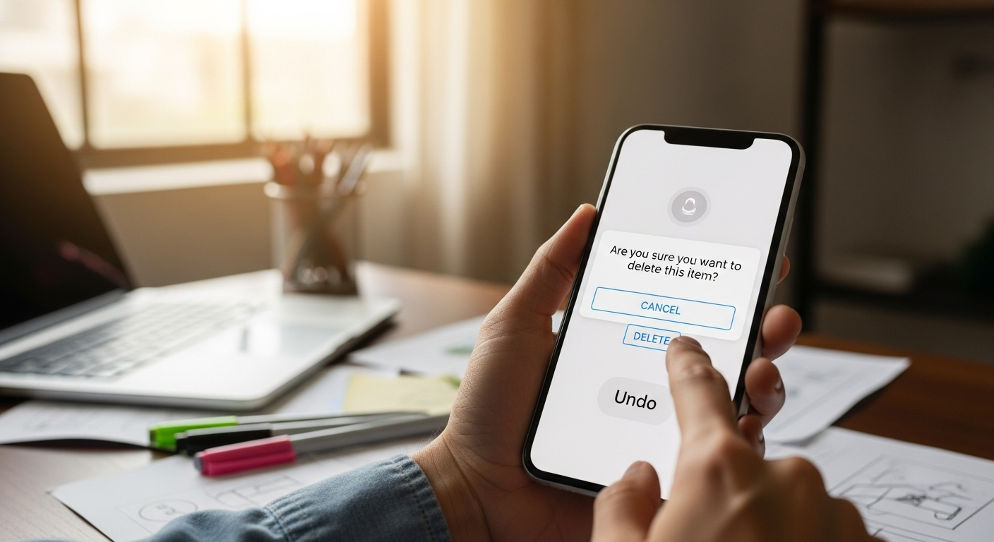
Toast-Based Undo — The Gmail Pattern Everyone Loves
One of the most elegant forgiveness patterns ever designed is the toast-based undo. Popularized by Gmail's "Undo Send" and now ubiquitous across Google products, this pattern works by delaying the execution of the user's action and displaying a non-intrusive notification with an undo button.
The beauty of this pattern is that it doesn't interrupt the user's flow. They take their action (send an email, archive a message, delete a file), and a small toast notification appears at the bottom of the screen: "Message sent. Undo?" If they ignore it, the action completes. If they click undo, they're returned to the previous state. The action is effectively buffered for 5-30 seconds, giving the user a window to catch their mistake without requiring a modal interruption.
When to Use Toast-Based Undo
This pattern works best for actions that are performed frequently, have mild to moderate consequences, and benefit from immediate execution. Sending messages, archiving items, starring content, marking as read or unread: all great candidates. The action is executed immediately (no frustrating lag), but the user has a brief window to reverse course.
I've implemented this pattern across several products and consistently see the same results: users love it. It becomes a signature feature, something they mention in feedback. The psychological effect is powerful. Users feel like the product has their back.
Implementation Considerations
Toast-based undo requires careful timing. Too short (under 3 seconds) and users don't have time to react. Too long (over 30 seconds) and the toast becomes a blocking element. In my experience, 5-7 seconds is the sweet spot for most actions. The undo button should be prominent within the toast, large enough to tap on mobile and clearly labeled.
The toast should also include some contextual information about the action being undone. "Email sent to John. Undo?" is better than "Action completed. Undo?" If the action was destructive, acknowledge it: "Email deleted. Undo?" The more specific the toast, the more likely users are to recognize their mistake and act on it.
One pattern I strongly recommend against is the "X" dismiss button on these toasts. When users see an X, they naturally close the toast without thinking, defeating its purpose. Instead, let the toast auto-dismiss after the undo window expires. If users want it gone immediately, they can tap outside the toast or interact with the main interface, which should also dismiss it.
Undo History and Multi-Level Recovery
For creative and productivity tools, single-level undo is rarely sufficient. Users need to explore, to try different approaches, experiment with changes, and back out of dead ends. This requires a robust undo history that supports multiple levels of reversal.
The Undo Stack Pattern
An undo stack records every user action as a reversible operation. Each undo reverses the most recent action and moves the pointer backward. Redo moves the pointer forward, restoring undone actions unless new actions are taken, which clears the redo stack.
This pattern is well-established in desktop creative tools, but it's increasingly important in web and mobile apps. Figma, Notion, Google Docs, and virtually every modern productivity app implements multi-level undo. Users expect it. If your product deals with content creation and doesn't offer multi-level undo, you're operating below user expectations.
The Version History Pattern
Beyond the undo stack (which is ephemeral), version history provides a permanent record of changes that users can browse and restore. Google Docs, Notion, Figma, and GitHub all implement version history, each with slightly different approaches.
Version history serves two purposes: it provides a safety net when the undo stack has been exhausted (the user made a change hours or days ago and now wants to reverse it), and it provides traceability (users can see who made what change and when). For collaborative products, version history is essential. Conflicts and accidental overwrites are inevitable, and users need a way to recover.
The design challenge with version history is discoverability and usability. Users rarely know it exists, and when they find it, they're often confused by the interface. A well-designed version history should be easy to find (a menu item or button), easy to browse (with previews or diffs), and easy to restore from (one-click recovery with clear confirmation).
The Auto-Save Pattern
Auto-save is perhaps the most important forgiveness mechanism that users take completely for granted. Before auto-save, losing work was a daily occurrence: a crash, a power outage, or even just forgetting to save could cost hours of effort. Modern products that save automatically have made this pain almost invisible.
But auto-save introduces its own forgiveness challenges. When everything is saved automatically, how does a user undo a change they made yesterday? How do they recover from a cascade of accidental edits? This is where version history and undo stacks become essential complements to auto-save. Together, they form a comprehensive forgiveness system: auto-save protects against crashes, undo protects against recent mistakes, and version history protects against long-term errors.
Error Prevention vs. Error Recovery
There's an ongoing debate in the UX community about whether prevention or recovery matters more. The honest answer is that you need both, but they serve different roles and should be applied judiciously.
Error prevention — making it hard or impossible for users to perform dangerous actions — is the first line of defense. Disabling the "Send" button when required fields are empty, showing character counts before users exceed limits, and providing inline validation before form submission are all examples of prevention. These patterns stop errors before they happen, saving users the frustration of recovering.
Error recovery — making it easy for users to bounce back from mistakes — is the safety net when prevention fails. Undo buttons, confirmation dialogs, trash folders, and version history all fall into this category. Recovery acknowledges that no matter how good your prevention is, users will still make mistakes — and it provides a dignified way out.
The tension between them is real. Over-invest in prevention, and your interface becomes rigid and frustrating. Users feel hemmed in by constraints. Over-invest in recovery, and users can make serious mistakes before catching them. The right balance depends on context.
For high-frequency, low-consequence actions (sending messages, archiving items, adjusting settings), lean heavily on recovery. Toast-based undo and single-click recovery are ideal. For low-frequency, high-consequence actions (account deletion, permanent data erasure, financial transactions), lean on prevention. Multi-step verification, confirmation checkboxes, and delayed execution are more appropriate.
My general rule is: prevent errors that would be catastrophic or difficult to recover from, and enable recovery for errors that are easy to make and easy to fix. This keeps the interface flowing for the vast majority of actions while providing robust protection for the ones that truly matter.
Designing for Irreversible Actions
Some actions are truly irreversible. There's no undo for sending a physical product, canceling a flight, or posting a public message that's already been seen by thousands of people. When you can't offer a technical undo, you need to offer something almost as good: a clear, honest preview of what's about to happen, and a deliberate, commitment-requiring flow.
The Preview-and-Confirm Pattern
Before committing to an irreversible action, show the user a preview of exactly what will happen. This is common in financial applications: "You are about to transfer $5,000 from Checking to Savings. Confirm?" But it works well for any irreversible action. The preview should include all relevant details: amounts, recipients, dates, consequences.
The key insight here is that preview and confirmation should be distinct steps. Show the preview first, let the user review it, and then require an explicit commitment to proceed. Don't combine preview and confirmation into a single step. Users need to see the details before they can meaningfully confirm.
The Escalated-Permission Pattern
Some irreversible actions should require a higher level of permission than the user's current session provides. Re-entering a password, providing a biometric scan, or getting approval from a second user are all examples of escalated permission. This pattern is common in enterprise software (requiring manager approval for large purchases) and security-sensitive applications (requiring re-authentication for admin actions).
The escalated-permission pattern adds friction deliberately, but it's friction with a purpose. It ensures that the user is who they claim to be and that they're acting with full awareness of the consequences. For genuinely irreversible actions — account deletion, data export, security setting changes — this pattern should be strongly considered.
The Soft Delete as an Alternative
Whenever possible, turn irreversible actions into reversible ones. Soft delete (marking an item as deleted without actually removing it from the database) is the most common example. The item disappears from the user's view but remains restorable for a period of time (typically 30 days). This transforms an irreversible action into a reversible one, dramatically reducing user anxiety.
I've seen products implement soft delete for virtually every delete action — messages, files, accounts, even entire projects. The cost is additional database storage and some complexity in handling "deleted" state, but the UX benefit is enormous. Users who accidentally delete something can recover it themselves, and the support tickets related to "I accidentally deleted X" drop to near zero.
If your product doesn't implement soft delete (at least a trash or recycle bin), start there. It's the highest-impact forgiveness pattern you can add for the least engineering effort.
Accessibility Considerations in Error Recovery
Forgiveness patterns must be accessible to all users, including those who use assistive technologies. Too often, undo notifications, confirmation dialogs, and recovery flows are implemented without consideration for screen readers, keyboard navigation, or cognitive disabilities. This creates a two-tier system where some users have forgiveness and others don't.
Screen Reader Support
Toast notifications that disappear after a few seconds pose a major accessibility challenge. Users who navigate with screen readers may not hear the toast before it vanishes. Solutions include making toasts persistent until dismissed, implementing status announcements via ARIA live regions, and ensuring that undo actions can be triggered from keyboard shortcuts.
Confirmation dialogs should use proper ARIA dialog patterns, including focus trapping, Escape key handling, and proper labeling. The dialog should be announced to screen readers automatically, and focus should move to the first interactive element within the dialog.
Keyboard Navigation
Every forgiveness pattern should be fully operable from the keyboard. Undo should have a keyboard shortcut (Ctrl+Z / Cmd+Z is universal). Confirmation dialogs should support Tab navigation through buttons and Enter/Space for activation. Toast undo buttons should be reachable and activatable via keyboard.
Cognitive Accessibility
Users with cognitive disabilities may find confirmation dialogs particularly challenging. Clear language (no technical jargon), concrete button labels (not "Yes/No"), generous timeouts (not 3 seconds but 10-15 seconds for reading), and the ability to review information multiple times are all important considerations.
For toast-based undo, consider users who may need more time to process the notification and react. The 5-second default that works for most users may be insufficient for others. Allowing users to adjust undo timeouts in settings is an excellent accessibility improvement that also benefits power users.
Real-World Examples That Get It Right
Let me share some of my favorite examples of forgiveness in action, with specific design decisions that make them work.
Gmail's Undo Send. The poster child for timed undo. The genius isn't just the undo itself, but the customizable timeout (5, 10, 20, or 30 seconds). Power users set it short; cautious users set it longer. The toast notification is clear, specific, and includes a large target for the undo button. The action is actually delayed server-side, so even closing the browser doesn't prevent the undo.
Figma's Undo History. Figma demonstrates multi-level undo at its best. The version history panel shows a visual timeline of changes, each labeled with the user and time of the edit. Named versions allow teams to bookmark important states. Branching history handles collaborative conflicts. And the keyboard shortcut (Ctrl+Z) works exactly as expected, even in a browser-based tool.
Slack's Unsend and Edit. Slack offers a brief window to edit or delete sent messages. The pattern is elegant: after sending a message, clicking the "..." menu within 5 minutes offers both edit and delete options. For delete, there's a secondary confirmation. The result is a forgiving chat experience that still maintains message integrity.
Apple's Screenshot Deletion. When you take a screenshot on iOS, a thumbnail appears in the bottom-left corner. If you ignore it, it saves. If you tap it, you enter an editing interface. If you swipe it away, it deletes, but only after you explicitly confirm "Delete Screenshot?" This is a textbook example of combining toast-based patterns with confirmation dialogs for a forgiving, no-pressure experience.
GitHub's Restore Branch. GitHub offers an elegant recovery flow for deleted branches. After deletion, a banner appears with a "Restore" button and the option to create a pull request from the restored branch. This transforms a potentially catastrophic action (deleting a branch with unmerged work) into a minor inconvenience. The specificity of the recovery options shows deep understanding of the user's context and goals.
Notion's Page History. Notion's page history is one of the most forgiving version recovery systems in any productivity tool. Every change is recorded, and users can browse through the full history of any page, see what changed (with visual diffs), and restore any version with one click. The feature is discoverable from a simple menu, and the interface is remarkably user-friendly for such complex functionality.
Framework Summary — A Decision Tree for Forgiveness Patterns
Here's the practical decision framework I use when designing forgiveness patterns. Run through these questions in order, and the pattern will reveal itself:
Step 1: Can the action be made reversible?
If yes — implement undo (preferably multi-level). Offer a timed undo toast for actions that feel immediate. Implement a trash or recycle bin for deletions. This is almost always the best solution.
Step 2: If not fully reversible, can it be cushioned?
Implement a soft delete with a recovery window. Add version history. Provide auto-save backups. These mechanisms don't prevent the action but make it recoverable.
Step 3: Is the consequence serious enough for a delay?
If the user would suffer genuine distress from an accidental execution, add friction. Confirmation dialogs (with specific, actionable information), time-delayed execution, or two-step verification are appropriate.
Step 4: Is this a high-frequency or low-frequency action?
High-frequency actions need lightweight forgiveness (toast undo, single-click recovery). Low-frequency actions can handle more friction (confirmation dialogs, escalated permission).
Step 5: Is the user in a flow state?
If interrupting the user's flow would be costly (writing, designing, coding), lean toward non-modal patterns (toast notifications, background processing) rather than modal dialogs.
Step 6: What's the worst case?
Design for the worst plausible scenario. If a user could accidentally delete an entire project, build multiple layers of protection — confirmation + trash + version history. If the worst case is a mildly annoying email, a lightweight toast undo is sufficient.
This framework isn't rigid. Every product and every context is different. But it provides a starting point for thinking systematically about forgiveness, which most teams simply don't do. The next time you're designing a destructive action, run through these six questions. I promise you'll land on a better pattern than the "Are you sure?" dialog you were about to use.
Designing for forgiveness isn't just about preventing errors. It's about acknowledging that your users are human, that humans make mistakes, and that your interface should be compassionate enough to catch them. Products that offer genuine forgiveness stand out. They build trust, reduce anxiety, and create the kind of user experience that people genuinely enjoy.
The most successful products I've worked on all share one thing in common: they treat their users like human beings who sometimes make mistakes. Not like careless operators who need to be punished, but like valued partners who deserve a safety net. When you design with forgiveness at the core, you are building a better relationship with every person who uses your product.
References
- Nielsen Norman Group. "Confirmation Dialogs Can Prevent User Errors — If Not Overused." https://www.nngroup.com/articles/confirmation-dialog/
- Nielsen Norman Group. "User Control and Freedom (Heuristic #3)." https://www.nngroup.com/articles/user-control-and-freedom/
- Nielsen Norman Group. "Error Prevention (Heuristic #5)." https://www.nngroup.com/articles/error-prevention/
- Nielsen Norman Group. "Usability 101: Introduction to Usability." https://www.nngroup.com/articles/usability-101-introduction-to-usability/
- Laws of UX. "Peak-End Rule." https://lawsofux.com/peak-end-rule/
- Laws of UX. "Tesler's Law." https://lawsofux.com/teslers-law/
- UX Collective. "Designing for Forgiveness." https://uxdesign.cc/designing-for-forgiveness-in-ux-7b8d3b1e2a0f
- Smashing Magazine. "Designing Error Messages That Actually Help Users." https://www.smashingmagazine.com/designing-error-messages/
- Apple Human Interface Guidelines. "Undo and Redo." https://developer.apple.com/design/human-interface-guidelines/undo-and-redo
- Material Design. "Confirming Actions." https://m3.material.io/components/dialogs/guidelines
- Google Material Design. "Snackbars and Toasts." https://m3.material.io/components/snackbar/guidelines
- W3C Web Accessibility Initiative. "Designing for Cognitive Accessibility." https://www.w3.org/WAI/cognitive/
- Jakob's Law of Internet User Experience. https://lawsofux.com/jakobs-law/
- "The Design of Everyday Things" by Don Norman. Basic Books, 2013.
- "About Face: The Essentials of Interaction Design" by Alan Cooper et al. Wiley, 2014.
Published by Timothy Graf | GrafWeb / GrafWeb CUSO — UX design theory, interaction patterns, and human-centered design practices.