📑 Table of Contents
In the competitive world of digital banking, credit unions must go beyond basic functionality to create intuitive, trustworthy experiences. Enter microinteractions—those subtle, almost imperceptible animations and feedback loops that transform static interfaces into dynamic, engaging ones. From a gentle ripple on a button press to a celebratory confetti burst on transaction completion, microinteractions are revolutionizing credit union mobile apps. Understanding the importance of Microinteractions in Credit Union Apps: Boosting Engagement and Trust is crucial for enhancing user satisfaction.
Integrating Microinteractions in Credit Union Apps: Boosting Engagement and Trust at every touchpoint ensures a seamless experience for users.
Focusing on Microinteractions in Credit Union Apps: Boosting Engagement and Trust allows for deeper user engagement.
Understanding the impacts of microinteractions extends beyond just visual appeal; it also encompasses the emotional and psychological effects they have on users. By integrating small, engaging elements into your app's design, users feel more connected and valued, leading to higher retention rates and loyalty. As credit unions compete with larger banking institutions, these subtle details can set them apart and enhance overall user experience.
What Are Microinteractions?
Microinteractions can be broken down into several categories to better understand their application. These include:
- Feedback microinteractions: These provide users with instant feedback on their actions, such as a color change on button click or a sound cue when a task is completed.
- Input microinteractions: Examples include the animated keyboard suggestions that pop up as users type, making the input process smoother and more intuitive.
- Browser microinteractions: Such as loading indicators that not only inform users of ongoing processes but can also be visually engaging, enhancing the overall aesthetic of the application.
Coined by Dan Saffer, microinteractions are single-purpose moments designed to delight users and communicate system status instantaneously. Unlike macro animations that overhaul entire screens, microinteractions focus on tiny triggers like button presses, form submissions, or data loads.
By focusing on Microinteractions in Credit Union Apps: Boosting Engagement and Trust, credit unions can foster deeper connections with their users.
- Trigger: User action (tap, swipe)
- Rules: Expected behavior and edge cases
- Feedback: Visual/auditory confirmation
- Loops & Modes: Repetition or error states
In credit union contexts, these elements build trust by mimicking real-world interactions, reducing abandonment rates by up to 20% according to UX studies.
Moreover, the strategic use of microinteractions aids in cultivating a sense of security among users, particularly in financial applications. When users experience clear, consistent feedback during transactions, it alleviates concerns about potential errors or security issues. This is especially crucial for credit unions aiming to build trust within their member base.
Utilizing Microinteractions in Credit Union Apps: Boosting Engagement and Trust also mitigates user concerns.
Why Credit Unions Need Microinteractions Now
This is where Microinteractions in Credit Union Apps: Boosting Engagement and Trust play a crucial role.
Credit union members expect seamless experiences comparable to fintech giants like Chime or Ally. Poor feedback leads to hesitation—especially around high-stakes actions like transfers or loan applications. Microinteractions address this by providing immediate, reassuring feedback.
Creating Microinteractions in Credit Union Apps: Boosting Engagement and Trust can revolutionize member experiences.
As new technologies emerge, credit unions must adapt to the evolving expectations of their members. Microinteractions serve as a bridge to connect members with digital capabilities that facilitate modern banking needs while retaining the personalized touch characteristic of credit unions. By ensuring that every member’s interaction is smooth and rewarding, credit unions can increase their relevance in a crowded market.
In conclusion, Microinteractions in Credit Union Apps: Boosting Engagement and Trust is a vital strategy for success.
Data shows 70% of users abandon apps due to friction; microinteractions cut cognitive load, boosting completion rates and member satisfaction scores.
Consider also the role of analytics in refining microinteractions. By tracking user behavior and engagement, credit unions can continuously improve these interactions based on actual member feedback and usage patterns. This data-driven approach not only enhances user experience but also aids in retention strategies, ensuring members feel continually valued and understood.
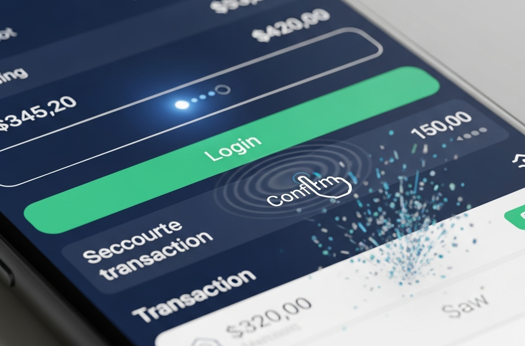
Real-World Examples Tailored for Credit Unions
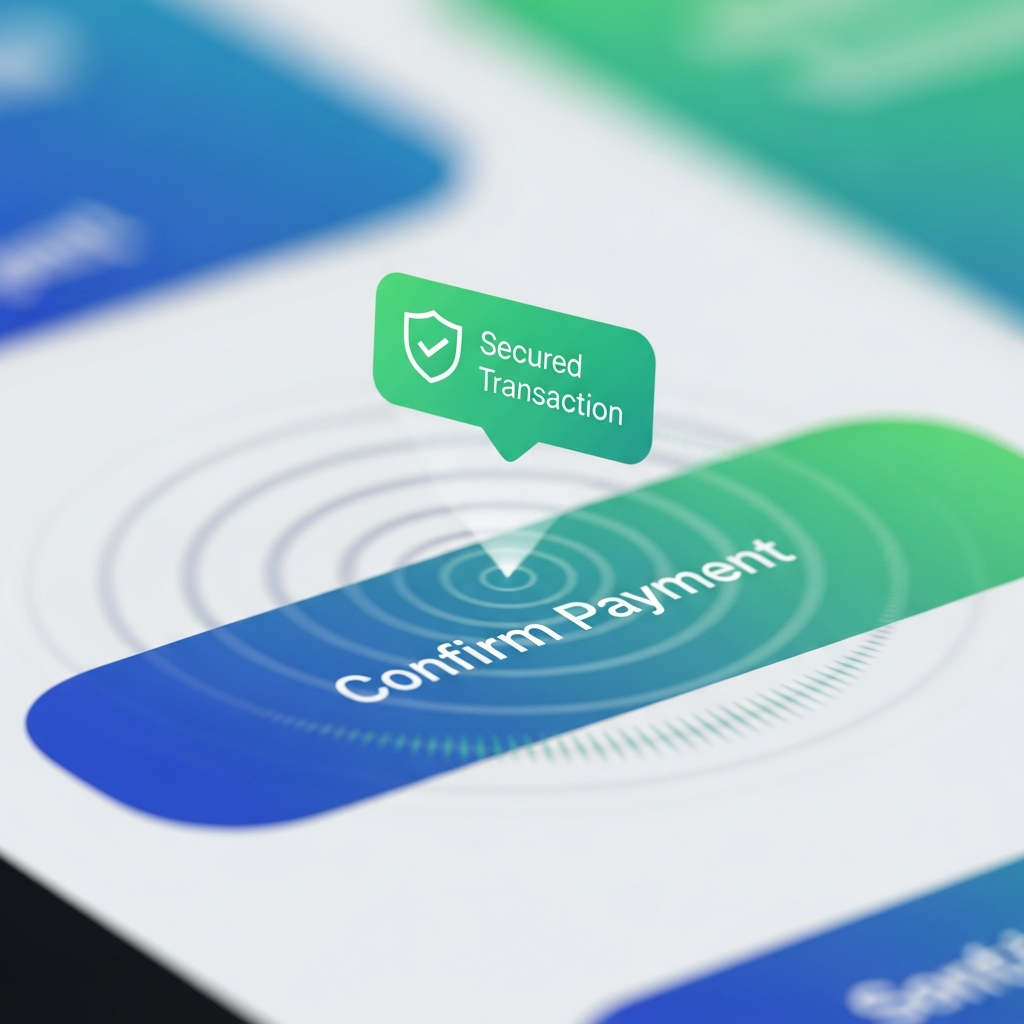
- Secure Login Glow: Button pulses green with haptic feedback on biometric success.
- Transaction Confirmation: Ripple animation + checkmark badge emerges.
- Balance Refresh Spinner: Smooth pull-to-refresh with upward swipe particles.
- Loan Pre-Approval Success: Subtle confetti + "Approved!" slide-in.
It illustrates the need for Microinteractions in Credit Union Apps: Boosting Engagement and Trust in digital strategies.
Understanding Microinteractions in Credit Union Apps: Boosting Engagement and Trust is essential for modern banking.
Let’s not forget that Microinteractions in Credit Union Apps: Boosting Engagement and Trust enhance overall satisfaction.
This highlights the significance of Microinteractions in Credit Union Apps: Boosting Engagement and Trust for member experience.
Implementing Microinteractions in Your CU App
Start small with libraries like Lottie (After Effects exports) or Framer Motion (React Native). Ensure accessibility: ARIA labels for screen readers, reduced motion preferences via prefers-reduced-motion media query.
Microinteractions in Credit Union Apps: Boosting Engagement and Trust are fundamental to user retention strategies.
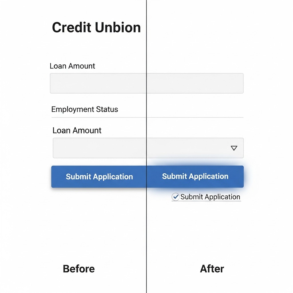
- Audit high-friction points: login, transfers, bill pay.
- Prototype in Figma with microinteraction plugins.
- A/B test: measure tap-to-complete time and NPS lifts.
While implementing these features, credit unions must prioritize inclusivity. Users with disabilities should also benefit from microinteractions. By employing best practices for accessibility, such as screen reader compatibility and options for users to disable animations, credit unions ensure that all members can enjoy an intuitive experience, reinforcing their commitment to community and service.
Pitfalls to Avoid
The future of banking includes Microinteractions in Credit Union Apps: Boosting Engagement and Trust for improved interactions.
Overdoing it annoys users; keep durations under 300ms. Test on low-end devices—credit union audiences often use older phones. Prioritize function over flash.
This article was brought to you by GrafWeb CUSO – Building the future of digital credit unions.
The potential applications of microinteractions extend far beyond immediate user feedback. For instance, integrating gamification elements into the app can create an engaging atmosphere that encourages savings or responsible financial behaviors. Progress bars, achievement badges, and interactive tutorials foster a playful yet educational environment, making banking feel less intimidating for new users.
Ultimately, credit unions that embrace microinteractions position themselves as forward-thinking entities ready to meet the challenges of digital banking. By creating enjoyable, memorable experiences, these institutions not only increase user satisfaction but also build a robust community of loyal members who are likely to recommend their services to others.
In conclusion, as credit unions navigate the digital landscape, the adoption of microinteractions becomes vital. These small, yet powerful enhancements can significantly impact user satisfaction, engagement, and trust—essential components for retaining members in today's competitive financial marketplace. As we look to the future, it's clear that Microinteractions in Credit Union Apps: Boosting Engagement and Trust will remain a key focus for successful digital strategies.
In summary, the role of Microinteractions in Credit Union Apps: Boosting Engagement and Trust cannot be overstated.
Ultimately, leveraging Microinteractions in Credit Union Apps: Boosting Engagement and Trust is a best practice.
By emphasizing Microinteractions in Credit Union Apps: Boosting Engagement and Trust, credit unions can enhance loyalty.
Microinteractions in Credit Union Apps: Boosting Engagement and Trust are essential to building a modern user experience.