Credit unions are facing a generational shift. Gen Z, now entering their prime banking years, demands digital experiences that feel alive, intuitive, and rewarding. Enter micro-interactions—those subtle, delightful animations and feedback loops that transform static apps into engaging platforms. In this article, we dive into how credit unions can leverage micro-interactions to boost retention, increase engagement, and convert more Gen Z users into loyal members.
What Are Micro-Interactions and Why Do Credit Unions Need Them?
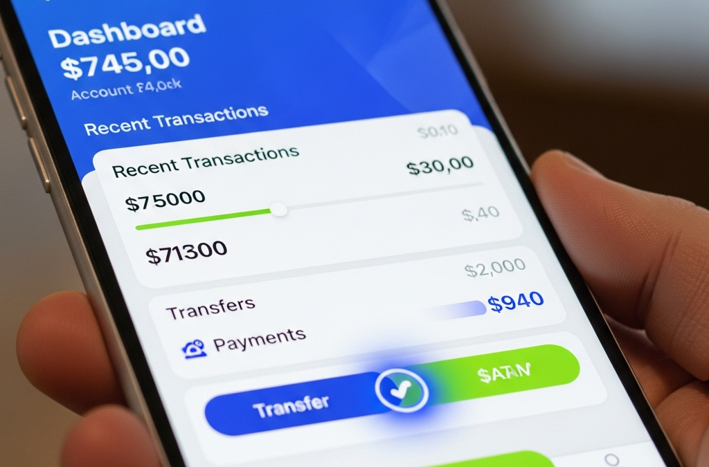
Micro-interactions are small, focused moments of animation or feedback that respond to user actions—like a button glowing on hover, a checkmark animating after a transfer, or a progress bar filling smoothly during loan pre-approvals. Coined by Dan Saffer's book Microinteractions, these elements make apps feel polished and human.
For credit unions, where trust and simplicity are paramount, micro-interactions bridge the gap between functional banking and emotional connection. Gen Z expects TikTok-level responsiveness; without it, they swipe away to fintech disruptors like Chime or Varo.
- Increase Engagement: 68% higher session times with subtle animations (per Nielsen Norman Group).
- Reduce Churn: Positive feedback loops encourage repeat visits.
- Build Trust: Smooth interactions signal reliability.
Targeting Gen Z: Real-World Examples in Credit Union Apps
Imagine a group of young adults discovering their credit union app's potential.

This vibrant energy translates to higher adoption when apps delight at every touch.
Key areas for credit unions:
- Dashboard Loads: Skeleton screens fading into balances with a satisfying "pop".
- Transaction Confirms: Confetti bursts for deposits or gentle slides for withdrawals.
- Navigation Swipes: Haptic feedback + easing curves for menu transitions.
Before and After: Transform Static Buttons into Engagement Magnets
The loan application button is a prime candidate for micro-interactions. Here's a visual breakdown:
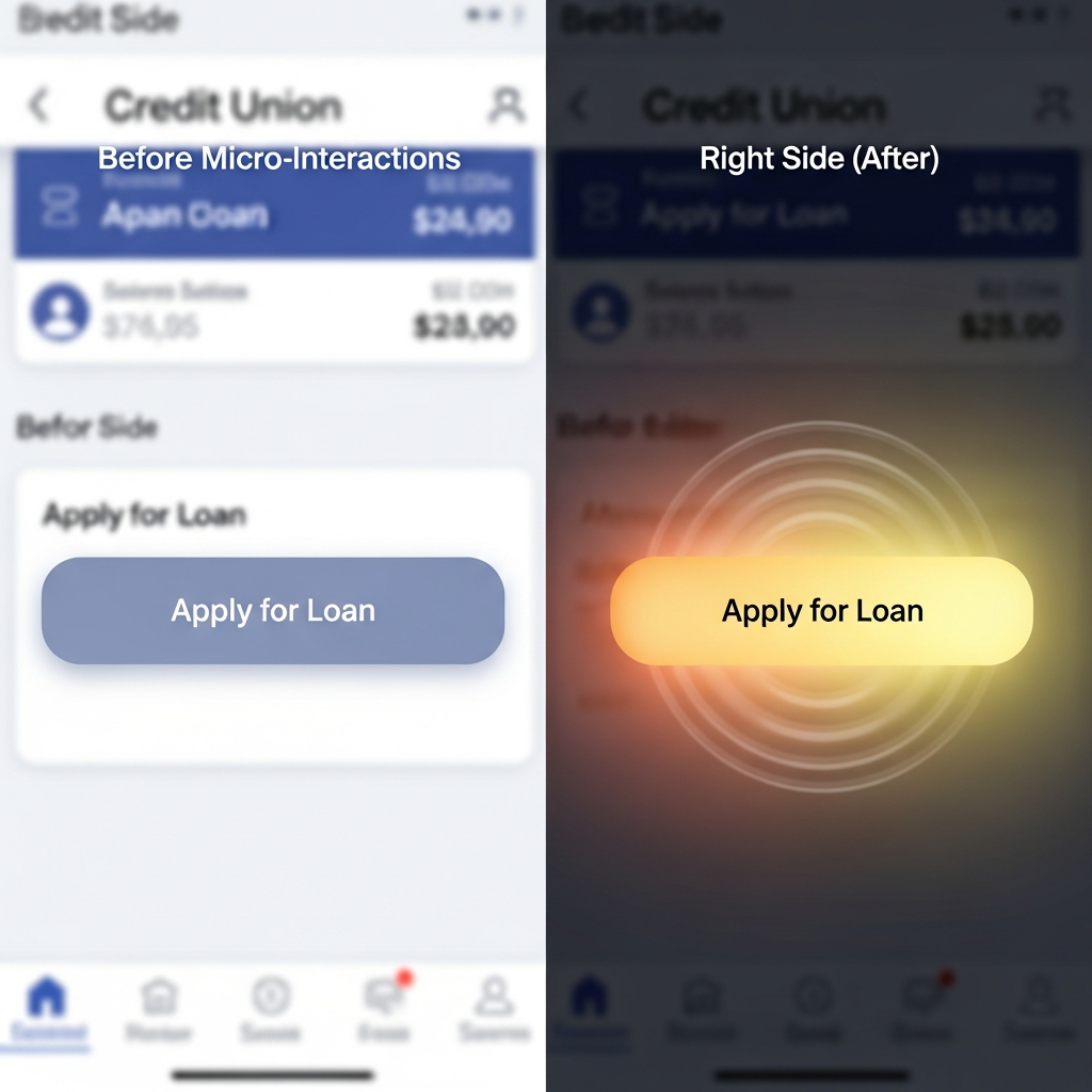
Before: Flat, unresponsive CTA leads to 40% abandonment.
After: Hover glow + tap ripple + loading spinner creates anticipation, lifting conversions by up to 25%. Implementation tip: Use Framer Motion (React Native) or Lottie for native iOS/Android.
Implementation Roadmap for Credit Union Digital Teams
Start small:
- Audit your app with tools like LottieFiles or Principle.
- Prioritize high-friction screens: Loans, transfers, onboarding.
- A/B test with 10% of Gen Z users via Firebase or Optimizely.
- Measure: Track Dwell Time, CTA Clicks, and NPS pre/post.
Pro tip: Ensure accessibility—pair animations with ARIA live regions and reduced motion toggles for WCAG compliance.
Future-Proof Your Credit Union with GrafWeb CUSO
Micro-interactions aren't gimmicks; they're the new standard for digital banking. Credit unions ignoring them risk obsolescence among digital natives.
This article was brought to you by GrafWeb CUSO – Building the future of digital credit unions.