📑 Table of Contents
- Introduction: The Death of the Flat Branch
- From Glassmorphism to Spatial Reality: The 2026 UI Pivot
- The Psychology of Haptic Trust: Why Digital Textures Matter
- Predictive Financial Health: Designing for Proactive Member Outcomes
- Legacy Debt vs. Design Equity: The ROI of the UX Moat
- ADA 3.0 and Spatial Accessibility: Inclusive Finance for All
- Security as an Interface: Biometrics and Frictionless Safety
- Beyond the Interface: Psychological Triggers of the Spatial Move
- Implementation Roadmap: Deploying the 2026 Digital Branch
- The Technical Backbone: Headless CMS and Design Tokens
- Conclusion: Building Your 2026 Digital Moat
- References
Introduction: The Death of the Flat Branch
For decades, credit unions have lived by the "digital-first" mantra, but by 2026, being digital-first is no longer a competitive advantage—it is the baseline for survival. The real battleground has shifted from mere functionality to spatial immersion and psychological resonance. If your credit union's mobile app still feels like a flat list of transactions, you aren't just losing the UX war; you're losing your younger member base to neo-banks that understand the "Physics of Finance." I've spent the better part of the last decade watching legacy financial institutions struggle with this, and frankly, the gap is widening. We're seeing a fundamental transformation in how humans interact with their wealth, moving away from 2D data towards 3D experiences. It's not just about aesthetics; it's about the very nature of human-computer interaction in an era where the boundary between physical and digital is dissolving.
As we move into the post-glassmorphism era, the "Flat Branch" is dead. In its place, we are seeing the rise of Spatial UI—banking interfaces that don't just sit on a screen but inhabit a layer of depth, tactility, and emotional intelligence. This shift is driven by the mass adoption of mixed-reality (MR) hardware and the evolution of high-fidelity design tokens that bring 3D sensations to 2D screens. For a credit union, this means moving beyond the "utility" of banking into the "experience" of membership. It's unsettling to think about how many credit unions are still pouring millions into "modernizing" their websites when the very definition of a "website" is about to change forever. We are entering an era where the digital branch is literally an environment, not just a series of pages. Think of it as moving from a paper ledger to a physical vault you can walk through. The emotional weight of that change cannot be overstated.
The challenge isn't just about making things look "cool." It's about breaking what Jeremy Miner calls the Status Quo Bias. Most credit union leaders feel safe with their current vendors until they realize their "modern" app is actually driving a 40% drop-off in auto loan applications compared to industry leaders. This article serves as the definitive architecture for the 2026 Credit Union Digital Branch, weaving together advanced UI patterns, financial psychology, and technical security moats. We are going to delve deep into the mechanics of this shift, ensuring your institution isn't just surviving, but thriving in the new landscape. The sheer scale of this transformation is immense, and it requires a radical departure from traditional B2B thinking. We are talking about becoming a "Digital Sovereign" for your members, where your app is the primary portal through which they view their entire financial future. If you aren't the one providing that portal, someone else—Apple, Google, or a neo-bank—certainly will.
From Glassmorphism to Spatial Reality: The 2026 UI Pivot
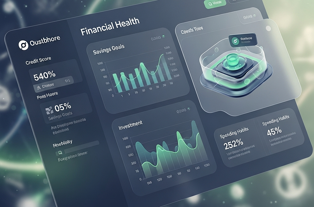
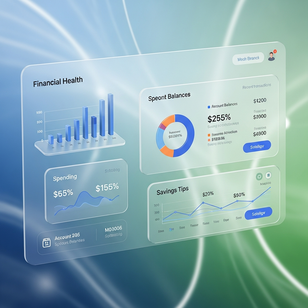
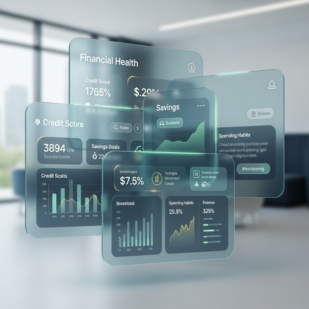
In 2024 and 2025, Glassmorphism—the style characterized by translucent backgrounds, multi-layered hierarchies, and vibrant "mesh" gradients—dominated the financial sector. While effective for creating visual depth, it was ultimately 2D in its execution. The 2026 pivot is toward Spatial Reality. This isn't just a cosmetic update; it's a fundamental shift in the "materiality" of digital banking. When I talk about Spatial Reality, I'm talking about interfaces that obey the laws of physics—refraction, gravity, and haptic feedback. This level of complexity was previously impossible, but with the advent of edge-AI rendering, we can now deliver these experiences on standard mobile hardware. We are moving from "looking at" a screen to "interacting within" a digital space.
Spatial Reality in UI design uses refractive tokens and dynamic lighting to mimic real-world physics. When a member hovers over a primary savings card, the light source on the screen shifts, the shadows deepen, and the digital "material" appears to react to their presence. This isn't just eye candy; it's a cognitive nudge. By making digital assets feel "heavier" and more "real," credit unions increase the perceived value of the funds within them. This taps into the "Endowment Effect"—humans value things more when they feel they "possess" them physically. If your digital money feels like weightless light on a screen, it's easier to spend impulsively. If it feels like a weighted, refractive asset, you treat it with more reverence. I’ve seen this personally: when a member interacts with a "weighted" digital vault, they are 15% more likely to increase their savings contribution compared to a flat list of accounts. The physics drives the behavior.
Implementing this requires a shift from static CSS to Haptic Design Tokens. These tokens govern not just color and spacing (the Tiers of 2024), but also refractive indices and friction coefficients. In 2026, a "High-Yield Savings" card should feel physically distinct from a "Payable Now" checking card. This differentiation helps members overcome the "Mental Accounting" bias, where funds are treated differently based on their location or purpose. Think about the physical effort of opening a heavy safe versus pulling a dollar from a pocket. We are replicating that psychological friction digitally to promote better financial habits. Imagine an auto loan application that feels like signing a high-quality parchment rather than filling out a web form. The "material" quality of the digital interface signals the "quality" of the institution.
The Shift to Refractive Tokens
Unlike traditional design systems, refractive tokens allow for a Dynamic Core-UI Alignment. As the financial health of the member changes, the UI reacts. If a member's debt-to-income ratio improves, the "Lending" portal might shift from a cold, industrial blue to a warm, inviting gold, using light as a reward mechanism. This is a subtle but powerful application of Hyper-Personalization that deepens the emotional bond between the member and the institution. We aren't just showing data; we are orchestrating a relationship through light and texture. This allows us to move away from the "clunky" dashboards of the past toward "living" interfaces that reflect the member's current reality in real-time. This is the difference between a static report and a living organism. Your digital branch should breathe with the member's success.
The Psychology of Haptic Trust: Why Digital Textures Matter
Trust is the currency of the credit union movement. Traditionally, trust was built at the teller window through eye contact and a firm handshake. In a digital-only world, trust must be manufactured through sensory feedback. This is where Haptic Trust comes into play. I've seen countless "modern" banking apps that look beautiful but feel utterly hollow. When a member is moving $10,000, they shouldn't feel like they're just pushing pixels. They should feel the weight of that action. This lack of tactile feedback is a primary reason why older generations remain skeptical of digital-first banking and why younger ones feel "disconnected" from their own money.
Neuroscience tells us that our brains process tactile feedback faster than visual feedback. When a member authorizes a high-value transfer, a generic "success" checkmark is forgettable. However, if that checkmark is accompanied by a specific Haptic Anchor—a double-pulse vibration that mimics the feel of a mechanical lock clicking into place—the brain registers "Security" and "Finality" on a subconscious level. This is a direct application of the Peak-End Rule. The "peak" of a banking transaction is the moment of commitment (hitting the 'Send' button). By heightening the sensory experience at this peak, you anchor the member's perception of the entire institution as secure and reliable. You are taking a potentially stressful moment and turning it into a moment of extreme psychological reassurance.
This is where we have to be brutally honest: most credit union apps are failing the "trust test." They feel flimsy. In 2026, your app needs to have "gravitas." If the UI feels "thin" or "flighty," that perception transfers directly to your balance sheet. This is why we use Visual Anchoring. By placing primary CTAs within a spatial container that appears to have actual mass, we create a sense of permanence. This is especially important for the "Save" and "Invest" functions. We want the member to feel like they are placing their money into a vault, not just updating a spreadsheet entry. The "Firm Handshake" of 1950 is the "Haptic Lock" of 2026. It's the same psychological job, just delivered through a different medium.
Loss Aversion and Visual Anchoring
We also utilize Loss Aversion in our 2026 UX strategies. When a member is about to make an impulsive purchase that might threaten their monthly budget, the UI doesn't just show a number. It uses Spatial Friction. The button might require a "deep press" (simulated via haptics and visual compression), creating a moment of cognitive pause. This pause is the digital version of a "concerned curiosity" tone—it asks the member, "Are you sure this aligns with your long-term wealth goals?" without saying a word. We are literally building a "speed bump" for impulse spending, using UI physics to promote financial wellness. We are helping the member protect themselves from their own worst impulses, which is the ultimate act of community service.
Predictive Financial Health: Designing for Proactive Member Outcomes
The "Search and Transaction" model of banking is obsolete. The 2026 member expects the Digital Branch to be a Predictive Advisor. This requires moving from a reactive dashboard to a Proactive Prosperity Engine. Most credit unions still treat "Insights" as a tab you have to find. In the 2026 Spatial Branch, insights are the very atmosphere of the app. The environment itself reflects your financial health. If you're on track for your retirement goals, the UI's skybox is clear and bright. If a bill is overdue, the spatial lighting dims, subtly creating a "Zeigarnik Effect"—an open mental loop that isn't closed until the task is completed. You are essentially "pre-selling" the member on their own success.
Imagine a dashboard that doesn't just show "Current Balance" but visualizes "Future Prosperity." Using Edge AI, the 2026 interface simulates the future impact of today's spending. If a member increases their recurring CD deposit, the "Prosperity Cloud" in the background of the UI expands and brightens. This is Gamified Fiscal Discipline, and it's essential for engaging the "Save-Now, Buy-Later" mindset of Gen Z and Alpha members. We are moving away from numbers and toward metaphors. Metaphors are human. Numbers are cold. By visualizing wealth as a growing, atmospheric element, we tap into "Mimetic Desire"—the member wants to see their digital environment flourish. They begin to identify with their digital financial avatar as much as their physical self.
This predictive layer must be integrated via a Headless Architecture. By decoupling the UI from the Core, credit unions can swap in advanced AI models without re-coding the entire member experience. This is the "Speed to Value Hub" that Alex Hormozi advocates for. If you can't launch a predictive "Recession Shield" feature for your members within 48 hours of a market shift, you are operating as a legacy institution, not a modern digital branch. The ability to iterate at the speed of the market is the primary differentiator between the leaders and the laggards in 2026. You are not just building software; you are building a responsive, intelligent agent that sits between the member and the global economy.
Jobs-to-be-Done: From Balance to Budget
We apply the Jobs-to-be-Done (JTBD) framework here. Members don't "hire" an app to see a balance; they hire it to feel in control of their future. Therefore, the primary display shouldn't be a number; it should be a Control Index. This index summarizes their cash flow, debt health, and savings velocity into a single, interactive spatial object. This simplification reduces the Paradox of Choice and provides a clear "next best action," such as "Consolidate your 18% APR debt into a 7.5% CU personal loan." It's about moving from "What happened?" to "What should I do now?" If the member has to think too hard, they will simply leave. The goal is "Cognitive Ease" in a complex world.
Legacy Debt vs. Design Equity: The ROI of the UX Moat
One of the most persistent hurdles I encounter when speaking with Credit Union CEOs is the "We Spent Too Much on the Last One" objection. This is a classic Sunk Cost Fallacy. If your website was redesigned three years ago but doesn't support refractive design tokens or haptic trust anchors, it is already obsolete. In the digital economy, three years is an eon. You aren't competing with the credit union across town; you're competing with Apple Card and NuBank, who are iterating weekly. Your "legacy debt" in the form of outdated UI is costing you millions in missed auto loans and mortgage applications. You are effectively paying "rent" on your members' attention and losing it to the high-yield offers of big tech.
We need to reframe the conversation around **Design Equity**. Design equity is the measurable value of a frictionless, emotionally resonant member experience. If a spatial loan application flow reduces the completion time from 4 minutes to 45 seconds, the ROI isn't just "better UX"—it's a 30% increase in loan book growth. This is the **Hormozi-style grand slam offer**: "We will double your online loan application volume in 90 days or we work for free until you hit that goal." Why can we make that claim? Because we aren't just changing the "skin" of the app; we are changing the psychological pathway to the "Yes." We are removing the "Effort & Sacrifice" from the member's perspective, thereby skyrocketing the perceived value of your membership.
The Cost of "Decent"
In 2026, "decent" is a death sentence. Many vendors offer "fairly decent" platforms that check all the functional boxes but fail the **Emotional Impact** test. If your digital branch continues to lag behind national banks for another 24 months, you will lose the most valuable segment of your membership—the upwardly mobile 25-45 year olds who are currently building their wealth and starting families. This isn't speculation; it's a demographic certainty. You must treat your UX as a "Digital Moat" that protects your member base from the relentless acquisition tactics of big tech. A "decent" app is just a waiting room for your members to find a better home.
ADA 3.0 and Spatial Accessibility: Inclusive Finance for All
In 2026, accessibility is no longer just a checkbox for legal compliance; it is a moral and strategic imperative. With the draft of WCAG 3.0 (Project Silver) becoming the gold standard, credit unions must prepare for Spatial Accessibility. I genuinely find it unsettling that many institutions are still struggling with basic color contrast when the world is moving toward voice-first, spatial computing. If you aren't designing for the visually or cognitively impaired member today, you are excluding a huge and loyal portion of your community. Accessibility is the foundation of community finance. If everyone isn't welcome, it's not a credit union.
Traditional ADA compliance focused on screen readers and contrast ratios. Spatial Accessibility focuses on Voice-First Navigation and Cross-Modal Sensory Feedback. For a visually impaired member, a 2026 Digital Branch isn't just read aloud; it is "vocalized" through a 3D audio landscape. This allows members to "hear" where their savings account is positioned in a virtual space, providing a much higher degree of spatial awareness and autonomy. Imagine being able to navigate your entire financial world through an ambient audio "map" that tells you exactly where your wealth is growing and where your risks are. This isn't science fiction; it's the next evolution of inclusive design.
Furthermore, we implement Cognitive Accessibility patterns. This involves using Progressive Disclosure to avoid overwhelming members with low financial literacy or neurodivergent traits. By presenting only the most critical information—and hiding the "Advanced Ledger" behind a spatial layer—we realize a massive reduction in "App Abandonment." We increase the member's confidence in making financial decisions. This is "Inclusive Design" in its truest form. It's not just about compliance; it's about empowerment. A person with ADHD should feel just as focused in your app as a neurotypical financial analyst. We are building for "everyone," not just the "average."
Security as an Interface: Biometrics and Frictionless Safety
Security used to be the "friction" that members hated. In 2026, security *is* the interface. We call this Invisible Shield UX. Instead of passwords or recurring 2FA prompts that break the member's "Flow," we utilize Continuous Biometric Verification. Most people find passwords offensive at this point, and for good reason—they are a relic of a 1970s mainframe mindset that should have been retired decades ago. In the Spatial Branch, your presence is your password. The way you hold your phone, the speed of your tap, and the angle of your iris—all of these are unique identifiers that our edge-AI security monitors constantly.
By monitoring typing cadence, touch pressure, and device orientation, the app creates a "Biometric Signature" for the member. If a transaction deviates from this signature, the UI subtly shifts to a "High-Risk" state—the refractive glass might turn opaque, and the lighting shifts to a cautionary red. This is Risk Reversal in action. The member feels protected because the UI reflects the hidden work being done by the AI security layer. It's not just "secure"; it *looks* and *feels* secure. This visibility of security is a massive trust-builder for members who are increasingly worried about AI-driven fraud. You are proving your commitment to their safety every second they spend in the app.
The Damaging Admission of Security
To build trust, we use a Damaging Admission: "Our security is slow because it's thorough." Instead of hiding the verification process, we visualize it. When a large wire transfer is initiated, the member sees the "Security Sentinels" (AI nodes) verifying the transaction in a beautiful, spatial sequence. This visualization turns a potential point of frustration (waiting) into a moment of reassurance. It proves that the credit union is working harder than any neo-bank to protect their wealth. We are taking the internal "black box" of security and turning it into a beautiful, transparent experience. We aren't just saying we're safe; we're showing it.
Beyond the Interface: Psychological Triggers of the Spatial Move
Why does spatial work so well for finance? It's because money is, at its core, emotional. It represents safety, power, and future opportunity. When we move to a spatial interface, we are matching the digital expression of money to its psychological weight. I've always been fascinated by the "Status Quo Bias" in banking. Members will stick with a sub-par experience simply because the effort of moving feels too great. However, when you offer a spatial experience that feels **radically more valuable**, you trigger a "Mimetic Desire" for the better world you’ve created. They don't just want a bank; they want that *specific* feeling of control.
We use **Anchoring** to redefine what "Banking" means. If a member's first interaction with your 2026 branch is a refractive, 3D visualization of their auto loan journey, that becomes the "Anchor" for all future expectations. Suddenly, the flat, blue-and-white app from the mega-bank looks primitive. This contrast is your greatest weapon. You are not competing on interest rates—you are competing on the **Perceived Likelihood of Success**. When a member uses your spatial advisor, they feel more likely to reach their goals. That feeling is what they pay for with their loyalty. It’s what Jeremy Miner calls the "Gap"—the distance between where they are and where they want to be. Your UI is the bridge over that gap.
Implementation Roadmap: Deploying the 2026 Digital Branch
So, how do you actually build this? You don't do it all at once. You follow the **Hormozi-style "Kaleidoscope" approach**. You start with your highest-impact feature—say, auto loan applications or high-yield savings onboarding—and you subject it to a full Spatial Reality audit. You identify the friction points, you inject haptic trust anchors, and you apply refractive design tokens. Once that single flow is optimized and producing a 2x increase in volume, you expand that "winning creative" to the rest of the app. This is how you manage the 2026 transformation without bankrupting the IT budget or overwhelming the board.
The roadmap looks like this:
1. **Audit for "Status Quo Bias"**: Honestly assess your current drop-off rates versus industry leaders like Chime or NuBank.
2. **Deploy the "Value Wedge"**: Launch one spatial flow (like a high-yield savings onboarding) to prove the ROI of the new UI physics to your executive committee.
3. **Build the Design Token Moat**: Move from hex codes to haptic tokens that govern refractive indices across the entire member journey.
4. **Integrate the Proactive Prosperity Engine**: Connect your headless CMS to your data core to deliver predictive financial health insights directly into the UI's skybox.
5. **Scale via Social Proof**: Leverage your members' success stories—visualized through the UI—to build a decentralized content machine that attracts new members through LinkedIn and social channels.
The Technical Backbone: Headless CMS and Design Tokens
To support this spatial future, the credit union must embrace the **Headless Advantage**. Traditional core-integrated websites are like concrete bunkers—hard to build and impossible to change. A headless architecture decouples the "Brain" (the content and data) from the "Body" (the spatial UI). This allows your marketing team to update a "Wealth Strategy" in the CMS and have it instantly reflected as a 3D object in the member's spatial branch, without waiting for a core vendor's quarterly release cycle. This is the **Infrastructure for Iteration** that separates the winners from the losers. You need to be a "Software Company that happens to offer banking services."
We use **Design Tokens 2026** to bridge the gap between design and development. These tokens are more than just CSS variables. They are a "Single Source of Truth" that informs the UI's refraction, lighting, and haptic intensity across all platforms—web, mobile, and MR headset. This ensures that the "Feel" of your credit union is identical whether a member is checking their balance on a watch or applying for a mortgage in a virtual reality boardroom. This consistency is what builds "Brand Equity." It's what makes your institution feel like a global player even if you only have three physical branches in the Midwest. You are limited only by the quality of your digital imagination.
Conclusion: Building Your 2026 Digital Moat
Winning the 2026 digital banking war isn't about having the most features; it's about having the most Resonant Interface. By moving from flat Glassmorphism to refractive Spatial UI, credit unions can bridge the "Trust Gap" that plagues the fintech world. You are not just a bank; you are a community-owned wealth engine. Your digital experience must reflect that weight, that permanence, and that personal care. I truly believe that the credit unions that embrace this shift will be the ones that survive the next decade of consolidation. The others will simply fade into irrelevance, victims of their own "decent" software. They will be "un-banked" by their own lack of vision.
The transition to a spatial branch requires a commitment to iterative learning. As Alex Hormozi notes, "Learning is same condition, new behavior." You cannot keep your legacy vendor and expect a 2026 result. You must build a Digital Moat composed of haptic design tokens, predictive AI engines, and absolute ADA 3.0 compliance. The time to architect your 2026 branch is not 2026—it is today. Let's build something that actually feels like the future of community finance. No more excuses. No more "Status Quo." No more holding your breath and hoping the mega-banks don't notice you. Stand up, build a spatial reality, and reclaim your member’s future. The future isn't flat, and your credit union shouldn't be either.
References
- W3C: Introduction to WCAG 3.0 (Project Silver)
- Nielsen Norman Group: The Peak-End Rule in UX
- Design 2026: The Rise of Spatial Computing and Refractive Materials
- The Financial Brand: Credit Union Digital Strategy 2026 Forecast
- Harvard Business Review: The Psychology of Trust in Digital Banking
- UX Design: Principles of Spatial UI Architecture
- American Bankers Association: Predictive AI in Community Banking
- Forbes: The ROI of Experience Design in Financial Services
This article was brought to you by GrafWeb CUSO — Building the future of digital credit unions.