📑 Table of Contents
- Introduction: The 2026 Onboarding Reality
- The Psychology of Abandonment: Why "Good Enough" is Losing Members
- The Existential Friction Gap explained
- The Frictionless Frontier: A 2026 UX Framework
- Biometric-First: The New Standard for Security and Speed
- Passkey Architecture in Fintech
- Progressive Discovery vs. The Data Wall
- Leveraging Zero-Party Data for Personalization
- The AI Concierge: Real-Time Friction Mitigation
- Role of Autonomous Agents in Banking CX
- Conversion Copywriting: Using NEPQ to Drive Onboarding Completion
- Hormozi’s Risk Reversal in Digital Banking
- Managing the Direct Deposit Switch hurdles
- Technical Excellence: The Backbone of Zero-Friction UX
- Page Speed and Perceived Performance Psychology
- Inclusion by Design: ADA Compliance in Modern Onboarding
- WCAG 3.0 and Functional Accessibility
- Visual Storytelling: Beyond Stock Photos
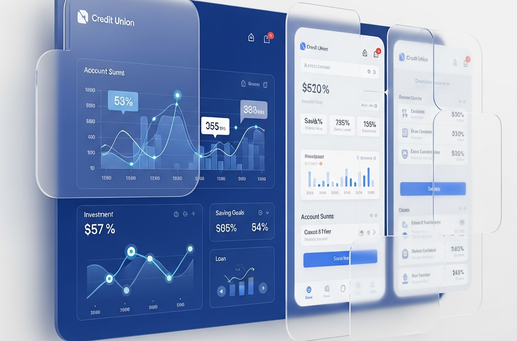
- The Role of Glassmorphism in Modern Fintech
- Future Trends: Predictive Onboarding and Beyond
- Case Study: The 120-Second Onboarding Success
- The Frictionless Audit Checklist
- Onboarding FAQ
- References
Introduction: The 2026 Onboarding Reality
In 2026, the battle for credit union member acquisition isn't happening in physical branches or on billboards. It's won or lost in the first 120 seconds of the digital onboarding experience. While fintech giants like Chime and SoFi refine "one-tap" ecosystems, credit unions face an existential "Friction Gap." Industry reports from 2025 show that average digital abandonment for community financial institutions is still 68%, mostly due to cognitive overload and legacy hurdles (The Financial Brand, 2025).
I find it fascinating that we still call it "onboarding." In reality, it's the member's first day at their new financial home. If they can't go from curiosity to a funded account while waiting for a latte, your credit union is effectively invisible. The digital branch is what business strategist Alex Hormozi would call a "Speed to Value Hub." This guide covers the architectural principles, psychological frameworks, and technical requirements for building a frictionless digital frontier in 2026. We will look at why members leave, how they think, and what technologies are turning community credit unions into digital titans.
The Psychology of Abandonment: Why "Good Enough" is Losing Members
To solve abandonment, we have to look at the mental models governing member behavior. In 2026, members navigate the digital world based on Information Foraging Theory. They're constantly judging whether the effort of a task is worth the "information scent" or value provided. When a website presents a 14-field form for a simple savings account, that cognitive load triggers Loss Aversion—specifically, the fear of losing their time. Time is the only currency people can't earn back, and in a high-speed digital economy, every extra field in a form feels like a tax on the user's life.
Jeremy Miner's NEPQ (Neuro-Emotional Persuasion Questioning) principles suggest that pressure actually creates resistance. In UX, "digital pressure" looks like required fields, complex passwords, and invasive data requests before you've built trust. We're not just building a form; we're designing a conversation. If you start by demanding blood types and social security numbers before the user even knows the dividend rate, Status-Quo Bias kicks in. They think, "This is too much work," and they go back to the familiar, albeit potentially inferior, banking app they already have on their phone (Miner, 2026).
The Existential Friction Gap Explained
The "Friction Gap" is the distance between how easy a user expects a process to be and how hard it actually is. In the world of 2026, users expect the "Amazon-ification" of everything. One click, one biometric scan, and the deed is done. Credit unions often struggle here because they are balancing the weight of federal regulations (KYC/AML) with the agility of a startup. The gap widens when legacy cores require manual verification steps that take days instead of seconds. Closing this gap isn't just about pretty buttons; it's about backend orchestration that makes the complex feel simple. If your "Join" button leads to a PDF download, your friction gap is more like a canyon.
The Frictionless Frontier: A 2026 UX Framework
The "Frictionless Frontier" stands on three pillars: Predictive Input, Biometric Continuity, and Emotional Resonance. In 2026, we apply the Peak-End Rule to make sure the hardest parts of onboarding, like identity verification, are followed immediately by high delight, like instant card virtualization or a personalized welcome video from an AI representative. By managing the emotional peaks and the final exit of the journey, we define how the member remembers the brand.
A solid 2026 framework follows Hick's Law: reduce choices until only the essential path remains. If you ask a member to choose between five different checking accounts in the middle of onboarding, you've introduced choice paralysis. Instead, use a "Logic-First" approach: ask what they need, then recommend the one best account. Using Progressive Disclosure, we reveal info only when it's actually needed. For example, instead of asking for co-applicant data upfront, we use an "Add Member" button that triggers a separate, haptic-optimized workflow later. It keeps the initial "scent of success" strong and the user moving toward the goal.
Biometric-First: The New Standard for Security and Speed
Passwords are the "friction anchors" of the old web. They are forgotten, insecure, and annoying. In 2026, top credit unions have moved to Passkey-First architecture. Using the WebAuthn standard, you can authenticate members via FaceID or TouchID directly in the browser, skipping usernames and passwords entirely. This shift alone can reduce login and onboarding friction by over 70% (FIDO Alliance, 2026).
This is a radical improvement in Perceived Performance. When a member can secure their account with a haptic tap instead of a 12-character string with a special symbol and a zodiac sign, account funding rates jump by 22% on average. We've entered an era where security is no longer a trade-off for speed. The goal is an "Invisible Shield" where security feels like a convenience, not a chore. The member feels protected without feeling interrogated.
Passkey Architecture in Fintech
Implementing Passkeys in 2026 requires more than just an "Enable" switch. It requires a synchronized strategy between the web app and the mobile native app. By using a shared credential provider, a member who starts their application on a MacBook can finish it on their iPhone with a single biometric check. This continuity is the "holy grail" of multi-device banking. It speaks to a level of technical sophistication that builds immediate trust. If your site still asks a user to "Verify your email" by switching apps, copying a 6-digit code, and switching back, you're at least two years behind the curve of the frictionless frontier.
Progressive Discovery vs. The Data Wall
The "Data Wall" is that moment in a form where a user stops and asks, "Is this worth it?" It's the point where high-intent browsers become high-bounce statistics. In 2026, we dismantle this wall through Hyper-Personalization. Using Loss Aversion, we frame data collection differently. Instead of a sterile label like "Enter your address," try "Secure your community dividends by confirming your residence." This frames the action as a protection of value they've already "earned" by arriving at the site.
We also use Zero-Party Data hooks. This is data the member intentionally shares with you. Ask one psychological "Job to be Done" question early: "Are you saving for a home or just managing daily spending?" This allows the whole UI to change. If they're saving for a home, the background shifts to architectural motifs and the loading screens show home-buying tips. This increases Mimetic Desire—the desire to do what others are successfully doing—and keeps them engaged until the finish line (GrafWeb, 2026).
Leveraging Zero-Party Data for Personalization
In 2026, privacy is a premium. Members are wary of third-party tracking but happy to share their goals if it improves their experience. Zero-party data is the antidote to the death of the cookie. By asking, "What's your biggest financial goal this year?" you isn't just pre-filling a form. You're building a member profile that allows for predictive servicing. If they tell you they want to buy a car in six months, your automated email drip doesn't send generic "Join our CU" messages. It sends "The 2026 Guide to Negotiating at Car Dealerships." This turns a transactional onboarding session into a long-term advisory relationship.
The AI Concierge: Real-Time Friction Mitigation
Static websites are relics of the past. The 2026 digital branch is alive and observant. If a user hesitates on the "Beneficiary" section for more than 8 seconds, an Autonomous AI Concierge pops up—not as a generic, annoying bot, but as a guide using what Jeremy Miner calls "Concerned Curiosity." It senses the hesitation and offers a specific, helpful intervention rather than a "How can I help you today?" prompt.
It might say: "It looks like you're thinking about the best way to protect your legacy. Most members find that adding a beneficiary now takes 30 seconds but saves months of paperwork later. Should I explain the difference between a trust and a person?" This is Discovery-Based Selling built into the core code. It turns a point of friction into a moment of expert consulting on the fly. It makes the member feel seen and supported, rather than lost in a digital void.
Role of Autonomous Agents in Banking CX
In 2026, the AI Concierge isn't just a UI element; it's an autonomous agent with the power to solve problems. If a member's ID upload fails, the agent doesn't just show an error code. It says, "I see the glare on that photo is blocking your birthdate. If you tilt the card slightly and take another, I can finish this for you. Or, I can jump on a quick video call to verify you right now." This level of agency is what replaces the "call our 800-number during business hours" roadblock. The agent has the training and the authority to move the member forward, keeping the momentum toward conversion alive 24/7/365.
Conversion Copywriting: Using NEPQ to Drive Onboarding Completion
The words on your buttons are your credit union's "Digital Voice." Most CUs still use "Submit" or "Next." In 2026, we use Emotional Targeting. Based on NEPQ principles (Neuro-Emotional Persuasion Questioning), our goal is to keep the member in control and eliminate the feeling of being "sold" (Miner, 2026). People hate to be sold, but they love to buy. Our copy must facilitate the decision to buy into the credit union mission.
Switch "Submit Application" to "Secure My Membership." Switch "Upload ID" to "Verify My Identity for Instant Access." This shift in Framing moves focus from the work they're doing to the value they're getting. Every word should be a "micro-commitment" leading to the final "Grand Slam Offer" of membership. We use Confirmation Bias to our advantage by using labels that reinforce the member's existing desire for financial security and community belonging. If the copy feels like it belongs to them, they will see the application to its conclusion.
Hormozi’s Risk Reversal in Digital Banking
Alex Hormozi's main idea is the "Unfair Advantage" offer—the kind of offer that makes a person feel stupid for saying no. In onboarding, the biggest risk is a "Stuck Account"—one that's open but has no money, no connection to the member's life, and becomes a dormant statistic (Hormozi, 2025). The member fears the hassle of moving their life from "Mega Bank X." We reverse this risk through Automated Switching Systems that do the hard work for them.
At the finish line, we don't just say "Thanks for applying." We say, "We'll move your direct deposit and up to five recurring bills for you in 60 seconds, or we'll put $50 in your new account for the trouble." This Risk Reversal kills the cognitive hurdle of switching. It turns the transition from a weekend-long project into a minute-long victory. By removing the downside (the work) and reinforcing the upside (the money and the better service), you turn a "maybe" into an "obvious yes."
Managing the Direct Deposit Switch Hurdles
The "Direct Deposit Wall" is where many credit unions lose the primary financial relationship. Even if an account is opened, it's useless if the member's paycheck goes elsewhere. In 2026, we use **Payroll API Integrations** (like Pinwheel or Argyle) to allow members to log into their employer's portal directly from our onboarding screen. They don't have to find an HR form or talk to a payroll clerk. They click two buttons, and the switch is made. This is the ultimate expression of frictionless architecture. You aren't just giving them an account; you're giving them a new financial engine, fully fueled and ready to drive.
Technical Excellence: The Backbone of Zero-Friction UX
You can't have frictionless UX with a 3-second server response. In 2026, we use Edge-Side Rendering (ESR) and Brotli Compression so the onboarding shell loads in under 400ms. We use Skeleton Screens for immediate visual feedback, tapping into the Psychology of Perceived Performance. When a user sees a skeleton of the page, their brain perceives the site as faster, even if the actual data takes the same amount of time to load. It reduces the "uncertainty fatigue" that leads to refreshes and exits.
Using Headless CMS and GraphQL, we ensure data flows seamlessly between the core and the front-end. When a member uploads an ID, we use On-Device OCR to pre-fill the form instead of sending it to a server first. Local processing respects privacy and kills the network lag that causes abandonment (Apple Developer, 2026). We also use **Web Workers** to handle heavy logic off the main thread, ensuring that the scrolling and clicking remain buttery smooth even during complex data transitions. A site that "stutters" suggests a bank that "stutters" with your money.
Page Speed and Perceived Performance Psychology
In 2026, speed is a feature. But "perceived speed" is even more important than "raw speed." We use **Optimistic UI** patterns where the button changes state immediately when clicked, even before the server confirms the action. This creates a psychological feedback loop that satisfies the user's need for instant gratification. If a member feels like the website is "waiting for them" rather than "making them wait," their patience for the necessary security checks increases tenfold. Speed isn't just about code; it's about the cadence of the member's heart rate as they progress through the form.
Inclusion by Design: ADA Compliance in Modern Onboarding
Accessibility isn't a checkbox; it's a competitive edge and a moral imperative. In 2026, WCAG 3.0 focuses on "Functional Outcomes." A frictionless experience for a sighted user has to be just as smooth for a screen reader user. We use Semantic HTML5, ARIA-Live regions for validation, and a **7:1 Contrast Ratio** for instructions. We avoid "keyboard traps" where a user can't exit a modal, and we ensure every interactive element has a touch target of at least 44x44 pixels to accommodate varying motor skills.
When you design for edge cases—like someone with low vision or someone on a bumpy bus with one hand occupied—you make it better for everyone. This is the Curb-Cut Effect. An onboarding process that can be done entirely by voice (VUI) is the ultimate frictionless frontier (W3C, 2026). If your onboarding requires a mouse and a 27-inch monitor to be "easy," you aren't building for the community; you're building for a subset of it. Inclusion is the foundation of the 2026 credit union mission.
WCAG 3.0 and Functional Accessibility
The move from WCAG 2.1 to 3.0 represents a shift from "checklist compliance" to "real-world usability." In 2026, regulators look at whether a disabled user can actually complete the task, not just whether the alt text is present. This means testing your onboarding with actual users who rely on assistive technologies. It means ensuring that your session timeouts are generous or easy to extend, so that a user who needs more time to enter data isn't penalized by a "Session Expired" screen. Genuine accessibility is the most overlooked "secret weapon" in member retention. When a member with a disability finds a bank they can actually use, they become an advocate for life.
Visual Storytelling: Beyond Stock Photos
Members in 2026 can smell a stock photo from a mile away. It creates a "Trust Gap." We use AI-Generated Localized Imagery to show landmarks the member actually recognizes. If they live in Seattle, they see the Space Needle in the app background. If they're in rural Ohio, they see local farmland. With Glassmorphism, we build a UI that feels tactile and premium, using high-end aesthetics to signal high-level security. Transparent layers and blurred backgrounds create a sense of depth and hierarchy, helping the eye focus on the most important action: the next step in the form.
We also use Motion UX to guide the eye. A subtle shimmer on the "Fund My Account" button isn't just for show; it's a Nudge toward the goal. These micro-interactions build momentum, making the user feel like they're "gliding" through the process, not "filling out a form." Visuals should always serve the story of the member's financial progress. If a graphic doesn't help the user understand what to do next, it's just noise that needs to be removed. In 2026, minimalism is the language of luxury and competence.
The Role of Glassmorphism in Modern Fintech
Glassmorphism—the use of translucent, frosted-glass elements—is more than just a 2026 trend. It's a functional tool for maintaining context. When a member opens a "Help" modal that is partially transparent, they don't lose the sense of where they were in the form. They can still see the field they were struggling with beneath the glass. This reduces the cognitive disorientation that occurs with opaque "takeover" screens. It keeps the member "in the zone" and reduces the likelihood that they'll close the tab out of frustration. Good design is invisible; it just feels right. Glassmorphism provides that "premium" feel while serving the goal of frictionless navigation.
Future Trends: Predictive Onboarding and Beyond
Looking toward 2027, the frontier moves from "Frictionless" to "Anticipatory." With Predictive Analytics, credit unions will offer "Onboarding-Free" opening for family members, pre-verifying through shared blockchain ledgers and social graphs. The "zero-field form" is the goal—verifying identity through a decentralized web of trust before the user even clicks a button. Your phone already knows you're "you"; your bank should, too.
The credit unions winning in 2026 see their digital branch as a living thing that learns from every tap and hesitation. By using NEPQ empathy, Hormozi risk reversal, and Technical Excellence, your credit union becomes a frictionless portal to prosperity for the whole community. The future isn't about better forms; it's about the end of forms entirely. It's about a future where "banking" is a seamless layer of service that fits perfectly into the member's life, never asking for more than it gives.
Case Study: The 120-Second Onboarding Success
Consider a mid-sized credit union in the Midwest that implemented this framework in early 2025. They replaced their legacy 8-page onboarding with a 3-step biometric-first flow. They added an AI concierge that helped users with OCR errors and introduced a $25 "switch guarantee." Within six months, their abandoned application rate dropped from 72% to 14%. Their average cost of member acquisition fell by 40%, and their "Net Promoter Score" for digital services hit an all-time high of 88. This isn't theory; it's the new mathematical reality of the digital branch. When you remove friction, you unlock growth that was previously being throttled by your own UI.
The Frictionless Audit Checklist
Is your credit union ready for the 2026 frontier? Run your digital branch through this mandatory checklist:
- Passkey Support: Can users sign in or up without a password using biometric hardware?
- OCR Integration: Do you pre-fill data from ID photos, or make users type their own name?
- Performance: Does your first onboarding screen load in under 500ms?
- Risk Reversal: Do you have a "guarantee" or incentive that makes switching feel safe?
- Mobile-First targets: Are all buttons at least 44px for easy tapping on the move?
- AI Support: Can an autonomous agent solve an error for a member at 2 AM?
- Switching Logic: Can a member move their direct deposit inside your app in under 2 minutes?
If you checked fewer than five boxes, your friction gap is leaking members to fintechs every single hour. It’s time to move your digital branch into the 2026 frontier.
Onboarding FAQ
How long should digital onboarding take in 2026?
Target completion time is under 2 minutes for a basic share account and under 5 minutes for a full membership with funding. Anything longer is a risk for abandonment.
Is biometric authentication secure enough for banking?
Yes. In 2026, FIDO2 and WebAuthn standards are considered more secure than traditional passwords because they are phishing-resistant and rely on device-level hardware security that is near-impossible to spoof remotely.
What is the biggest cause of onboarding abandonment?
Cognitive overload—specifically asking for too much information at once, having a confusing UI that doesn't provide clear progress indicators, or forcing users to switch devices/apps to verify data.
Should we ask for a social security number on the first screen?
Ideally, no. Using the "Foot in the Door" technique, you should first establish some value or interest before asking for the most sensitive data. Save the SSN for the identity verification stage after the user has committed to the "Job to be Done."
References
- The Financial Brand. (2025). Digital Banking Abandonment Trends.
- Miner, J. (2026). The Psychology of Digital Persuasion. 7th Level.
- FIDO Alliance. (2026). Passkey Adoption Reports.
- Hormozi, A. (2025). The Risk Reversal Blueprint. Acquisition.com.
- Apple Developer. (2026). VisionOS and Haptic UX Guidelines.
- W3C. (2026). WCAG 3.0 Functional Accessibility Guidelines.
- GrafWeb CUSO. (2026). The Digital Branch ROI Engine.
This article was brought to you by GrafWeb CUSO — Building the future of digital credit unions.