I've been designing interfaces for over a decade, and if there's one pattern I see teams get consistently wrong, it's the empty state. You know the one. You sign up for a new app, and you're greeted by a blank screen with a thin grey "No items yet" in 12px Helvetica. Or you hit a 404, and the page just goes white. Or you delete the last item in a list, and the whole screen collapses into a confusing void.
Most designers treat empty states as an afterthought, something to fill in when the hero sections, onboarding flows, and primary dashboards are done. But here's the thing: empty states are often the first thing a new user sees, the last thing a returning user remembers, and the moment that most determines whether someone gives up or pushes forward. They are not dead space. They are communication channels.
After years of studying hundreds of apps and running usability tests where participants hit empty states and either bounced or lit up, I've built a framework for designing these moments that I want to share. This article covers the three kinds of empty states every product needs, the anatomy of a great empty state, how to design error feedback that doesn't feel like punishment, and the common anti-patterns that are hurting your retention. Let's get into it.
📑 Table of Contents
- The Three Categories of Empty States
- The Anatomy of a Great Empty State
- First-Use Empties: Setting the Stage
- User-Cleared Empties: The Satisfaction Moment
- Error States: Designing for When Things Break
- 404 and System Error Pages: Beyond the Joke
- Loading States and Feedback Interfaces
- Designing Feedback That Builds Trust
- Common Anti-Patterns and Mistakes
- A Practical Empty State Design Framework
- Conclusion
- References
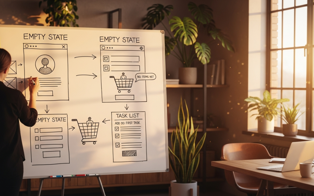
The Three Categories of Empty States
Before we talk about solutions, we need a shared vocabulary. Every empty state falls into one of three categories, and each requires a different design approach. Mixing them up is the most common mistake I see.
Category 1: First-Use Empties
This is the blank slate a user sees when they've just signed up and haven't done anything yet. No projects, no saved items, no transaction history. The inbox is empty. The dashboard is a ghost town. The playlist is quiet. This is arguably the most important empty state in your whole product because it's the user's first impression of what your product looks like when it has value. And right now, it looks like nothing.
A bad first-use empty tells the user nothing. A great one tells them exactly what to do next, shows them what value looks like, and makes them feel like they've joined something good. Stripe's dashboard does this beautifully: new accounts see a clean state that says "Get started: add your first payment" with a clear button and a helpful illustration. No confusion. No hunting. Just a single next step.
Category 2: User-Cleared Empties
This is the state a user reaches after they've completed or cleared all items. The Todoist "No tasks. You're all done!" screen. The inbox zero moment. This is emotional design territory because the user has just achieved something. The wrong design makes this feel like the end of the road. The right design makes it feel like a checkpoint on an ongoing journey.
The user-cleared empty is often a peak moment in the experience. The peak-end rule applies here (Nielsen Norman Group). If you design this as a celebration rather than a dead end, you compound the user's positive feeling right when they're most likely to share your product or come back later.
Category 3: Error States
Something broke. A page doesn't exist. The network failed. The server timed out. The user did something wrong and the database rejected it. These are the empties that carry the most emotional weight because they're associated with frustration, interruption, and failure. A bad error state compounds the negative emotion. A good one absorbs it, provides a path forward, and sometimes even makes the user smile.
Error states also include 404 pages, network failure screens, permission-denied states, and form validation failures that leave a page looking incomplete or broken. Each of these deserves its own design treatment.
The Anatomy of a Great Empty State
After studying hundreds of empty states across consumer apps, SaaS products, and e-commerce platforms, I've identified five components that the best ones share. You don't always need all five, but the more you include, the better the experience.
1. A visual that communicates the absence. This can be an illustration, an icon, or even a photograph. The key is that it should be intentional, not a default icon from a free set. Mailchimp's empty states use their signature style with a playful illustration of a chimp looking at an empty space. It's branded, it's warm, and it signals that this blank moment is part of the product's personality, not a bug.
2. Clear, human copy that explains the state. Not "No items found." That's a database query result, not a human message. Try "You haven't added any projects yet" or "Your inbox is clean! Time to celebrate." The copy should acknowledge where the user is without blaming them or sounding robotic. This is your chance to sound like a person, not a server log.
3. A primary action to take next. Every empty state should answer the question "What do I do now?" with a single, obvious call to action. "Create your first project." "Browse templates." "Invite a teammate." If there's no action to take, the empty state should explain why and what the user should expect. Dead-end empties (ones with no action and no explanation) are the number one reason users abandon products after signup.
4. Context about what normally lives here. Especially for first-use empties, users may not know what this section is for. A brief explanation of what this area will contain once it's populated helps build a mental model. "This is where your analytics live. Once you publish your first post, you'll see traffic data here." That single sentence transforms confusion into anticipation.
5. Optional: personality or delight. This is the polish layer. A subtle animation. A witty line. A background pattern that appears only when the list is empty. Slack does this well; their empty channel states feel like part of the product's fabric, not a hole in it.

First-Use Empties: Setting the Stage
First-use empties are the design equivalent of a blank canvas. They're intimidating, but not to the designer. Intimidating to the user. A completely blank interface raises anxiety because it gives the user no cues about what's valuable, what's possible, or where to start. This is one of those rare moments where the Jakob's Law works against you: users expect familiar patterns, and a blank slate is the least familiar thing of all.
The best first-use empties do three things simultaneously. First, they orient the user by explaining what this space is for. Second, they demonstrate value by showing or suggesting what a populated version looks like. Third, they reduce friction to zero by making the first action as easy as possible.
Look at how Notion handles this. When you create a new workspace, you're not met with a blank page. You're met with templates, suggested starter pages, and a guided setup. The "empty" state is actually full of helpful options. The team at Notion understood that true emptiness is paralyzing, so they filled the void with scaffolding that gets you started without feeling overwhelming.
Basecamp handles it differently but equally well. Their first-use empty for project pages shows a sample task with a line through it labeled "This is what a completed task looks like." It's brilliant because it teaches the user how to use the tool, demonstrates the satisfaction of completion, and provides a clear model for the user's first action: creating their own task.
For your own products, ask yourself: what is the smallest, simplest action a new user can take to get value from this screen? Then make that action the hero of your first-use empty state. Don't show "No projects" with a tiny "Create" link buried in the corner. Show a compelling illustration, a friendly explanation of what projects do, and a big, beautiful "Create Your First Project" button.
This isn't just about being friendly — it's about activation. According to Nielsen Norman Group research, users form their first impression of a product within 50 milliseconds. That first empty state is shaping their entire perception of your product's quality and utility. Design it like it matters, because it does.
User-Cleared Empties: The Satisfaction Moment
User-cleared empties are my favorite category because they're a design gift. The user has just accomplished something: cleared all their notifications, completed all their tasks, read every email. They're in a positive emotional state, and your empty state can either amplify that feeling or deflate it.
Todoist's "No tasks. You're all done!" screen is a textbook example. The text is celebratory. The illustration is cheerful. And critically, there's a hidden Easter egg where the little Todoist mascot does a dance if you wait a moment. It's pure delight, and it costs almost nothing to implement. But the impact on user sentiment is enormous.
Mailchimp's campaign empty state after you've sent your last email shows a high-five illustration between their chimp mascot and a human. It communicates "you did the thing" in a way that feels earned. It also includes suggested next actions: "Create another campaign" or "View your report." The celebration is real, but it's also strategic. The user is riding an emotional high, and that's exactly when they're most receptive to taking the next action.
The Peak-End Rule tells us that people judge an experience largely based on how they felt at its most intense point and at its end. For a user who just cleared their inbox or finished their last task, the empty state is the end of that micro-experience. Make it good, and they'll remember the product fondly. Make it flat, and they'll walk away feeling "that was fine," which in retention terms means "I'll forget this product exists."
Here's what I recommend for user-cleared empties: lead with celebration. Not confetti cannons and trumpet blasts, just genuine acknowledgment. "You did it. Everything's handled." Then transition to a forward-looking call to action. "Ready to start something new?" or "Here's what's trending while you were clearing things." The empty state becomes a bridge between accomplishment and re-engagement.
One thing I'd caution against: don't make the celebration feel like the product is congratulating itself. I've seen apps that say "You've reached inbox zero! We're so proud of you!" and it comes across as condescending. The celebration should be about the user's accomplishment, not the product's approval. Small distinction, big difference in how it lands.
Error States: Designing for When Things Break
Error states are the highest-stakes empty states because the user is already frustrated. They tried to do something, and it didn't work. The error state either makes things worse or turns a potential churn moment into a recovery moment.
I want to be direct here: most error states in modern applications are terrible. They show a red box with technical jargon that means nothing to the user. "Error 0x80070057: The parameter is incorrect." Great, thanks. That's like a mechanic saying "your car's thingamajig is misconfigured" and walking away.
The Nielsen Norman Group has published excellent guidelines for error messages that every designer should internalize. The core principles are simple but rarely followed: error messages should be human-readable, polite, precise, and constructive. They should tell the user what happened, why it happened, and most importantly, what to do about it.
Let me break down what a well-designed error state looks like:
1. Be explicit about what went wrong. "Your session expired" is better than "Please log in again." "The file you uploaded exceeds the 10MB limit" is better than "Upload failed." Specificity reduces user confusion and communicates that the system understands what happened. That builds credibility.
2. Take responsibility where appropriate. "Something went wrong on our end. We've been notified and are working on a fix" is more reassuring than "An unknown error occurred." GitHub does this well with their "500: Something is technically wrong. Thanks for noticing, we're going to fix it up and have things back to normal soon." It's honest, direct, and even has a bit of charm.
3. Provide a clear path forward. Every error state should have a primary action: "Try again," "Go back," "Report this issue," "Contact support." If the error is recoverable, show the recovery action. If it's a system error, offer to notify the user when it's fixed or provide an alternative way to reach their goal.
4. Don't make the user feel stupid. Error messages that blame the user, like "You entered invalid data," create negative emotional associations with your product. Reframe it: "We couldn't process that email address. Please check for typos and try again." The difference is subtle but psychologically significant.
5. Offer offline or degraded alternatives. If the primary feature is broken, can the user still do something useful? Google Docs' offline mode is the gold standard here. When the network drops, the interface doesn't break. It just shifts into offline mode with clear indicators. The user can keep working because the error state was designed as a state, not a wall.

404 and System Error Pages: Beyond the Joke
404 pages are a special case of error states that have become a design playground. Every designer knows about the GitHub 404 page, the Lego page, and countless other creative takes. I love a good 404 as much as anyone, but I think we've swung too far in the direction of "make it funny" and lost sight of "make it useful."
A 404 page that's purely a joke is just as bad as a 404 page that's a blank white screen. The user arrived somewhere they didn't expect, and the most helpful thing you can do is help them get where they were trying to go. A good 404 page should:
- Acknowledge the problem simply: "This page doesn't exist."
- Offer a search bar so the user can find what they were looking for.
- Link to the most popular pages or the homepage.
- Show the joke or illustration only after you've provided utility.
Airbnb's 404 page is a great model. It has their signature illustration style, a clear message about the page not existing, and a prominent search bar. The joke is there but it's not the hero. The utility is. Compare that to a page that spends 80% of its space on a funny illustration and buries the "Go Home" link in the footer, and you can see which one actually helps users.
I also want to talk about the less glamorous system error pages: 500 errors, 503 service unavailable, 403 forbidden, and network timeout pages. These feel scarier because they suggest the system itself is broken, not just the URL. For these, the design priorities shift:
- Show status indicators. Is the system down site-wide or just affecting this feature? Being transparent about scope reduces user anxiety.
- Estimate recovery time. "We're experiencing a temporary outage. Most services will be back within 30 minutes" is vastly more helpful than "Service Unavailable."
- Provide a way to check status. Link to a status page or offer to ping the user when things are back to normal.
- Cache when possible. Can the user at least see what they were working on before the error happened? Offline-first design patterns are relevant here even for web apps.
Stripe's error pages are a master class. Their 500 error page says "Something went wrong. We've been notified and are working to get things fixed." It's paired with a real-time status indicator and links to their status dashboard. The user feels informed, not abandoned.
Loading States and Feedback Interfaces
Empty states aren't just about what happens when there's no data. They also encompass the transitional moments between states, including loading screens, spinners, skeleton screens, and progress indicators that appear while content is being fetched. These micro-moments have an outsized impact on perceived performance and user trust.
There's a well-known principle from The Doherty Threshold: productivity soars when a computer and its users interact at a pace that ensures neither has to wait on the other. The threshold is around 400 milliseconds. Anything under that feels instantaneous. Between 400ms and 1 second, you need some feedback to maintain flow. Over 1 second, you need meaningful progress indication to prevent the user from abandoning the task.
The best loading states do more than just spin. They communicate progress, provide context, and sometimes even entertain. Facebook's old "Loading..." spinner that showed your friends' recent status updates turned a waiting moment into a discovery moment. LinkedIn's skeleton screens show the structure of the page before the content loads, so your brain starts processing layout before the data arrives. This makes the actual load feel faster through the cognitive load reduction of familiar structure.
Here's my take on loading states: skeleton screens beat spinners for content-heavy pages because they set expectations about structure. But skeleton screens fail when the actual content looks nothing like the skeleton. For example, showing a list skeleton when the result is a single hero image. In those cases, a branded loading animation with a progress indicator is better. The key is matching the loading treatment to the content type.
Skeleton screens also have a beautiful side effect for empty states: if you design your skeleton to show what a full page looks like, the user gets a preview of value before the real content loads. When the content does load and the page is actually empty, that's a different kind of disappointment, but that's why we design great empty states to handle that moment gracefully.
And please, stop showing spinners that hang for 30 seconds with no progress indicator. If your operation takes more than 2-3 seconds, show a determinate progress bar or an estimated time. The uncertainty of an indeterminate spinner is more stressful than knowing something is broken. I'd rather see "This is taking longer than expected" with a retry button than an infinite spinning wheel that my brain interprets as "the app is frozen."
Designing Feedback That Builds Trust
Every empty state is a form of feedback: the system communicating its current state to the user. But feedback goes beyond empty states. It includes confirmations, success messages, progress updates, and even haptic feedback on mobile. Together with empty states, these feedback patterns create the communication layer between your product and your users.
Good feedback builds trust. Bad feedback erodes it. And inconsistent feedback is worse than no feedback at all because it trains users to stop paying attention.
Here are the principles I use for feedback design across any interface:
Feedback should be immediate. Every user action should produce a reaction within 100 milliseconds. Even if the action takes seconds to process, acknowledge it immediately. Button press → visual state change. Form submit → loading indicator. Delete → confirmation or optimistic removal. The gap between action and reaction is where doubt lives.
Feedback should be proportional. A small action gets small feedback. A big action gets big feedback. This sounds obvious, but I see apps every day that show a full-screen success modal for "Email saved to drafts" or a tiny, easy-to-miss inline message for "Your account has been deleted." Match the feedback intensity to the action significance.
Feedback should be informative without being overwhelming. Toast notifications, inline messages, modal dialogs, tooltips, each has a place in the feedback hierarchy. The mistake I see most often is using modals for everything because they're "noticeable." Modals are interruption-level feedback. Reserve them for critical actions. Use toasts for confirmations, inline validation for form feedback, and snackbars for system-level notifications.
Feedback should be consistent. If you use green for success in one place, use green for success everywhere. If error messages appear below form fields in one form, place them below fields in every form. Consistency in feedback design is what allows users to predict how the system will behave, and prediction reduces cognitive load.
Google's Material Design guidelines for snackbars and toasts are a great reference point. They define not just the visual design but the behavior: how long a snackbar stays visible, how it interacts with other UI elements, when to use an action button versus a dismiss. That level of detail is what makes feedback feel intentional rather than bolted on.
Common Anti-Patterns and Mistakes
I've collected these over years of usability testing and design reviews. If you recognize any of these in your product, you're not alone, but you've got work to do.
The Blank Slate of Death
This is when you sign up for a product and the main content area is completely empty. No illustration. No helpful text. No call to action. Just a grey void with maybe a "No data" message in the center. This is the most common and most damaging empty state anti-pattern. Users don't know what to do, so they leave. If your product has one of these, drop everything and fix it.
The Overly Technical Error
"Error: SQLSTATE[23000]: Integrity constraint violation." The user does not know what this means. They can't action on it. It makes your product look broken and your team look careless. Every error message should be written for a human who has never seen your codebase. If you wouldn't say it to your grandmother, don't show it to a user.
The Dead End Empty State
The user clears their inbox, deletes everything, or reaches a logical endpoint, and the screen offers nothing. No next steps. No suggestion. No continuation. Just... an empty state that says "You're done. Goodbye." This is a retention killer because it ends the session on a flat note instead of a transition. Every empty state should answer "what next?"
The Lazy Generic Illustration
A generic "no data" icon from a free icon set. An illustration that doesn't match your brand style. A photo that was clearly grabbed from a stock library and has nothing to do with your product. These communicate that you don't care about this part of the experience. And if you don't care, why should the user? Custom illustrations for empty states are one of the highest-ROI design investments you can make because they're seen by every new user and every power user during transition moments.
The Spinner That Never Ends
An infinite loading spinner that doesn't show progress or estimated time. The user sits there waiting, not knowing if the app is working or frozen. Five seconds of spinning feels like an eternity when there's no progress indicator. Ten seconds and the user is looking for the back button. Thirty seconds and they're gone. If your operation takes time, show progress. If it's truly indeterminate, at least show a message like "Still working..." after a few seconds so the user knows the app hasn't crashed.
The Punishment Error State
Sometimes called "shame errors." These are error pages that scold or blame the user. "You entered an invalid email." "You don't have permission to view this page." "Invalid request." These feel like the system is angry at the user. Reframe every error as the system's inability to complete a request, not the user's failure. "We couldn't find that email. Please check for typos." "You'll need access to view this page, contact your admin to request it." The emotional shift is real and measurable.
The Missing Loading State
When a user clicks a button or navigates to a new page, and there's a delay with zero feedback, the screen just stays frozen until the new content appears. This is disorienting because the user can't tell if their action registered. Even a simple button state change (greyed out, shows "Saving...") prevents this confusion. For slower operations, a full loading state with a skeleton or spinner bridges the gap between action and result.
A Practical Empty State Design Framework
I've been using this framework in my own work for the past few years, and it's helped me turn empty states from afterthoughts into deliberate design decisions. Here's how it works.
For every screen in your product, ask five questions during the design phase — not during QA, not during implementation, but during the initial design exploration:
1. What does this screen look like when it has data? Understanding the populated state helps you design the empty state as a deliberate variation, not a fallback. If the populated state is a grid of cards, the empty state should show the grid structure or hint at what cards look like.
2. What category of empty state is this? First-use, user-cleared, or error? Each has a different emotional context and different design priorities. First-use empties should orient and activate. User-cleared empties should celebrate and transition. Error empties should inform and recover.
3. What's the single most helpful thing the user can do next? If your answer is "nothing," you've designed a dead end. Find something. A tour. A template. A settings option. A suggested action. Something. Every empty state needs a north star action that moves the user forward.
4. What should the user feel when they see this? Curious? Reassured? Celebratory? Motivated? The emotional design of an empty state is not a nice-to-have. It's the primary design challenge. You're communicating absence, and the way you do it shapes how the user feels about the product.
5. How does this state transition out? An empty state is a temporary condition. Design the transition. Does the user take an action that fills the space? Does content automatically appear after a condition is met? Does the empty state fade or slide away? Smooth transitions between empty and populated states make the product feel alive and responsive.
Here's the framework in practice. Let's say you're designing a notification center for a SaaS product:
- First-use empty: Show an illustration of the bell icon with notifications floating around it. Copy: "Stay in the loop. When someone mentions you, assigns you a task, or shares a file, you'll see it here." CTA: "Invite a teammate to get started."
- User-cleared empty: The user has read all their notifications. Illustration of the bell icon with a checkmark. Copy: "All caught up. You're on top of everything." CTA: "View your dashboard" or "Quick note: you have 3 pending tasks."
- Error empty: Notifications failed to load. Illustration of the bell with a sad face. Copy: "We couldn't load your notifications right now." CTA: "Try again" and "Check your connection."
Three different states. Three different emotional contexts. Three different designs. Same screen, same component, same user. That's what intentional empty state design looks like.
Conclusion
Empty states are not gaps in your design. They are the moments when your interface speaks most honestly to your users — because you've removed the informational noise and all that's left is the raw interaction between your product and the person using it. How you fill that space communicates everything about how much you respect your users' time, intelligence, and goals.
I've watched products completely turn around their activation rates just by redesigning their first-use empty states. I've seen customer support tickets drop by double digits because error messages became helpful instead of cryptic. I've heard users light up when they hit a user-cleared empty state that made them feel genuinely accomplished instead of abandoned.
None of this is expensive design work. It doesn't require complex animations or heavy engineering. It requires attention, empathy, and the willingness to treat every pixel of your interface — including the parts that have "no data" — as an opportunity to build trust.
Next time you're reviewing a design, look at the empty states first. If they're good, the rest of the product probably is too. If they're an afterthought, start there. You might be surprised how much difference a few thoughtful blank screens can make.
References
- Nielsen Norman Group — Error Message Guidelines
- Nielsen Norman Group — Peak-End Rule in UX Design
- Nielsen Norman Group — First Impressions and the Halo Effect
- Laws of UX — Doherty Threshold
- Laws of UX — Jakob's Law
- Laws of UX — Cognitive Load
- Laws of UX — Peak-End Rule
- Material Design — Snackbars and Toasts
- Nielsen Norman Group — How to Report Errors in Forms: 10 Design Guidelines
- Stripe — Error Page Design
- GitHub — 404 Page
- Airbnb — 404 Page
This article was brought to you by Timothy Graf | GrafWeb — design theory, interface patterns, and practical UX wisdom for product designers and digital teams. GrafWeb CUSO offers specialized credit union web solutions.